Complete Overview of the Wheelhouse Pricing Engine 8.0
A detailed exploration of the hospitality industry's most transparent & auditable pricing engine.


Updated May 1, 2023
Pricing engine: components
The image at the top of the page illustrates the essential components of the Wheelhouse pricing engine. The three most foundational models included in the illustration above are:
- The Base Price Model
- The Predictive Demand Model
- The Reactive Demand Model
As you explore this write-up, you will learn how these high-level components either include, or are amplified by, multiple additional models and statistical approaches, including:
- Location Impact
- Occupancy Impact
- Impact of Prior Bookings
- Booking Curves
- Gamma Warping
- Price Response Function
- Model Blending
- Calendar Control
- Vacancy Gaps
- Last Minute Discounting
- Dynamic Pacing Model
While complex, we believe that the 22% increase in revenue these models have driven for our users has made our efforts worthwhile!
Each day, our platform ingests, cleans, and processes ~20 billion new data points, analyzing 21MM listings across every major OTA in the short-term rental space, in order to inform a continuously relevant and accurate set of recommendations.
All of the models & approaches we list above inform how each listing should respond to booking patterns we see at the listing, neighborhood, market and regional level.
Let's step through these models, starting with our pricing engine’s foundation, the Base Price Model.
Part 1: Base Price Model
How our model determines an accurate price for your unit at ‘normal’ demand
As stated above, the Base Price Model is the foundation of each unit’s unique pricing recommendation. The goal of the Base Price Model is to discern an accurate median nightly price for each unit by analyzing the attributes of the property.
For example, we all know that a pool, a porch, parking and other attributes can impact the desirability of a given property.
And, while the value of these individuals attributes varies greatly over the course of a year (i.e. your pool is ‘worth’ more on July 4th than on January 4th), the Base Price Model is designed to determine the value of your unit for a day with average local demand.
To do this, the Base Price model analyzes:
- Attributes (e.g. bedrooms, bathrooms, parking, sleeps, unit type, etc.)
- Fees (e.g. cleaning fee, security deposit, extra guest fee, etc.)
- Location
- Booking performance (i.e. every booking, for your and nearby units)
And a range of additional factors.
Let us explore an example to learn more.
Detailed in the chart below are the five largest drivers of the Base Price in the San Francisco market (Note: real data is used throughout all examples in this write-up)

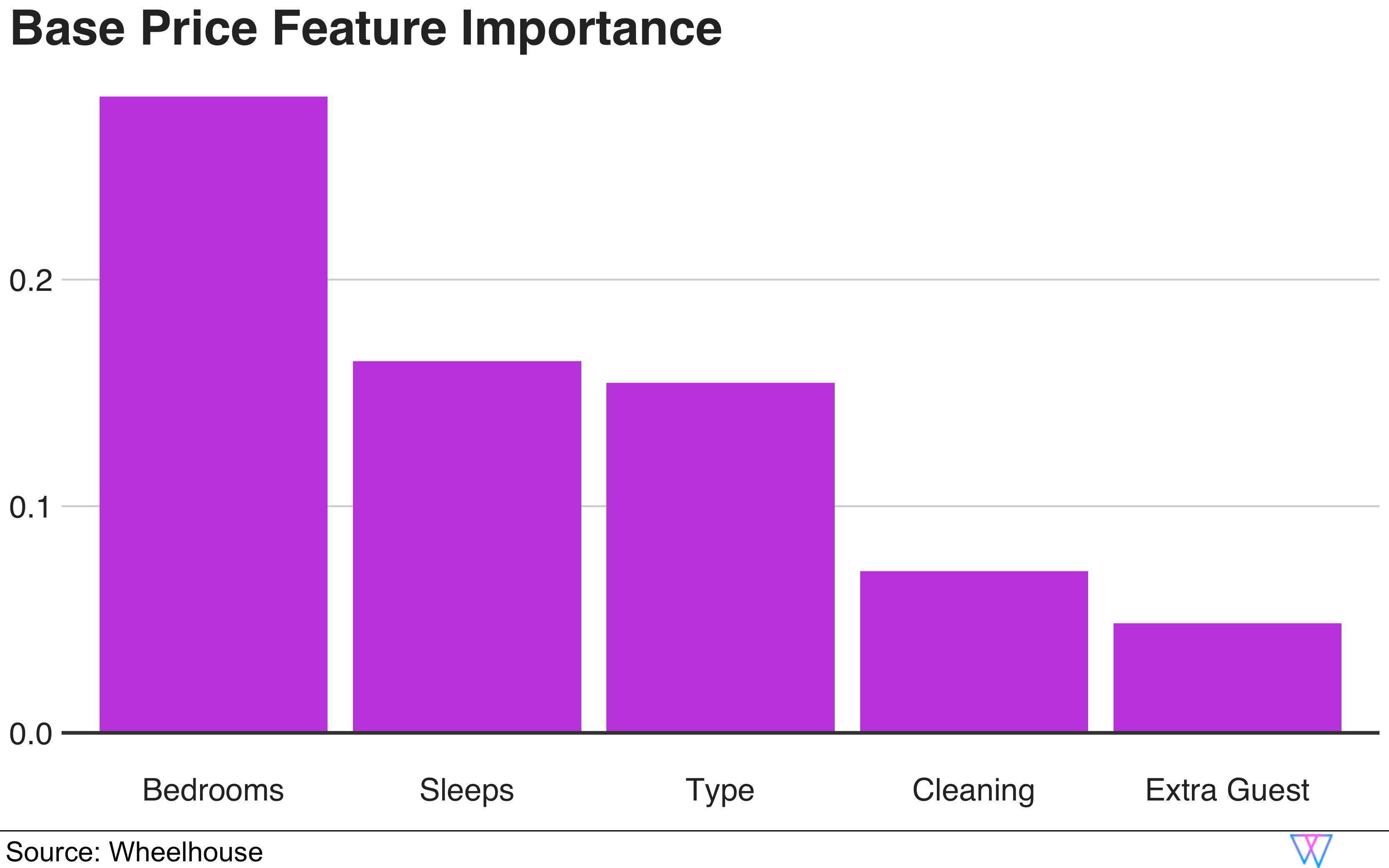
Perhaps unsurprisingly, bedrooms and sleeps (the number of people that can ‘sleep’ in a unit) have the largest impact on a given night’s price. In most markets, these two attributes are key drivers of the Base Price, as they are tightly correlated with the size (and hence the price) of a unit.
We can also see that the unit type (e.g. private room, entire apartment, full house, etc.) plays a significant role in determining an accurate Base Price in San Francisco, as do the extra fees (both cleaning and guest fees) associated with each stay.
While this graph offered us a high-level understanding of the value of the attributes, let us dive in more deeply to the most impactful attribute — bedrooms. To do this, we will examine a series of sample units that have:
- a variable number of bedrooms (From 0BR, i.e. a studio, to 4BR)
- But, all have one bathroom and ‘sleep’ four guests
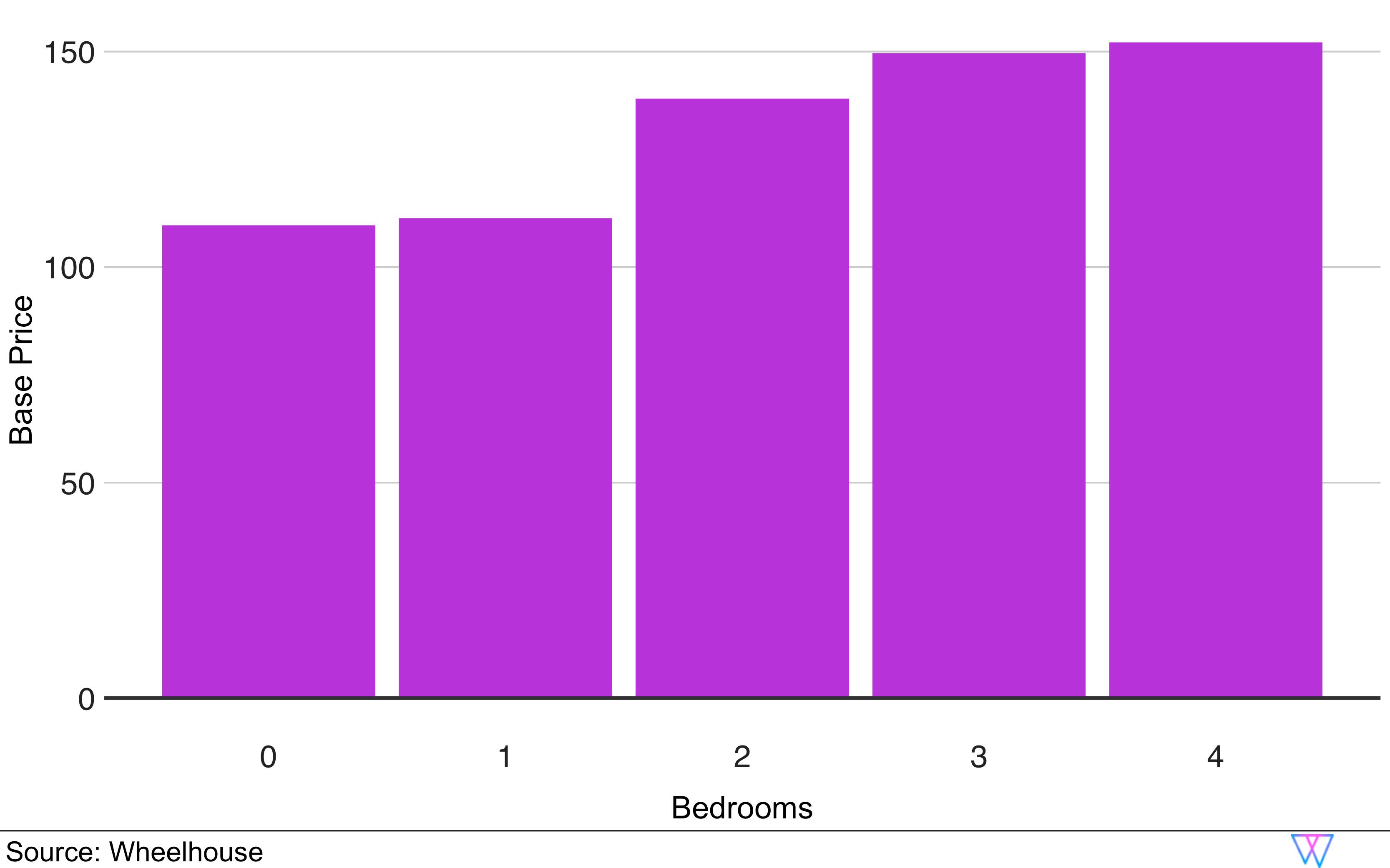
In fact, we can see that going from a studio (0BR) to a 1 BR barely impacts your recommended Base Price. Similarly, the impact of a 4th bedroom is de minimis, at least in San Francisco for units with 1 bathroom.
However, what you might have realized is that this example is constrained in the sense that all these hypothetical units are restricted to having 1BA and ‘sleeping’ 4. In reality, most 4BR units will both have more than one bathroom, and sleep more than 4 people.
Therefore, examining this constrained example illustrates a core aspect of our Base Price Model though, as it is intended to illustrate that an accurate Base Price must consider the value of attributes both individually and collectively.
Location impact
How our model infers demand signals around each unit’s location
The location of a unit can dramatically impact the perceived and actual value of that unit.
To determine this impact, our model leverages our Base Price Model, by applying spatial kriging to our Base Price Model’s residuals. In our model, the ‘residuals’ refer to percentage differences between our predicted and the actual median prices for each unit, as illustrated below.
In the visual below, we can see that our model has identified a set of clustered units (yellow dots) that mostly have a median nightly price above our ‘predicted’ median price (‘predicted’ based on the unit’s attributes).

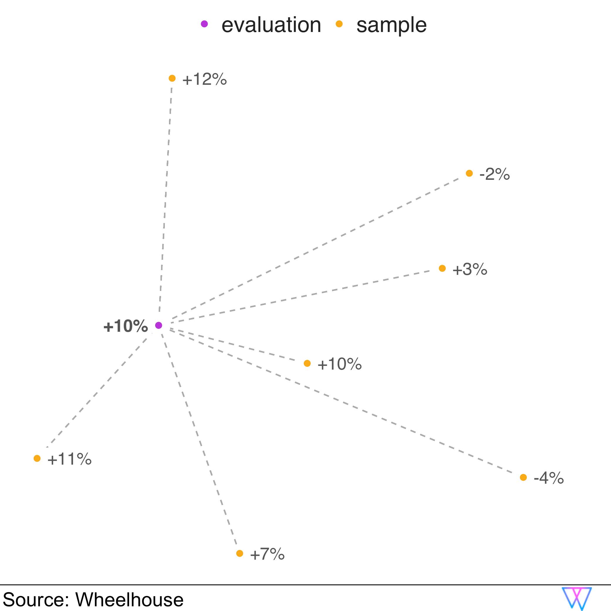
This collective pricing signal indicates that we are likely observing a high-value neighborhood, which in turn informs our location adjustment. In this case, a unit at the location of the purple dot would get a 10% increase in our Base Price recommendation.
Occupancy impact
How we leverage occupancy to verify our training data
One challenge in the short-term rental space is that many units are unintentionally (or intentionally!) ‘incorrectly’ priced.
Therefore, it is critical to leverage occupancy data (occupancy achieved over the prior year) to better understand how much our model should ‘weigh’ each unit’s pricing strategy. In combination with prices, the occupancy rate achieved by a unit can help us better understand whether a unit is overpriced or underpriced, relative to the market. Hence, we provide the occupancy as an input to our Base Price Model during training to tease out this relationship.
Of interest, despite units in the STR space being very unique, among the millions of units we have analyzed, the aggregate booking patterns reveal that the STR market is actually very efficient.
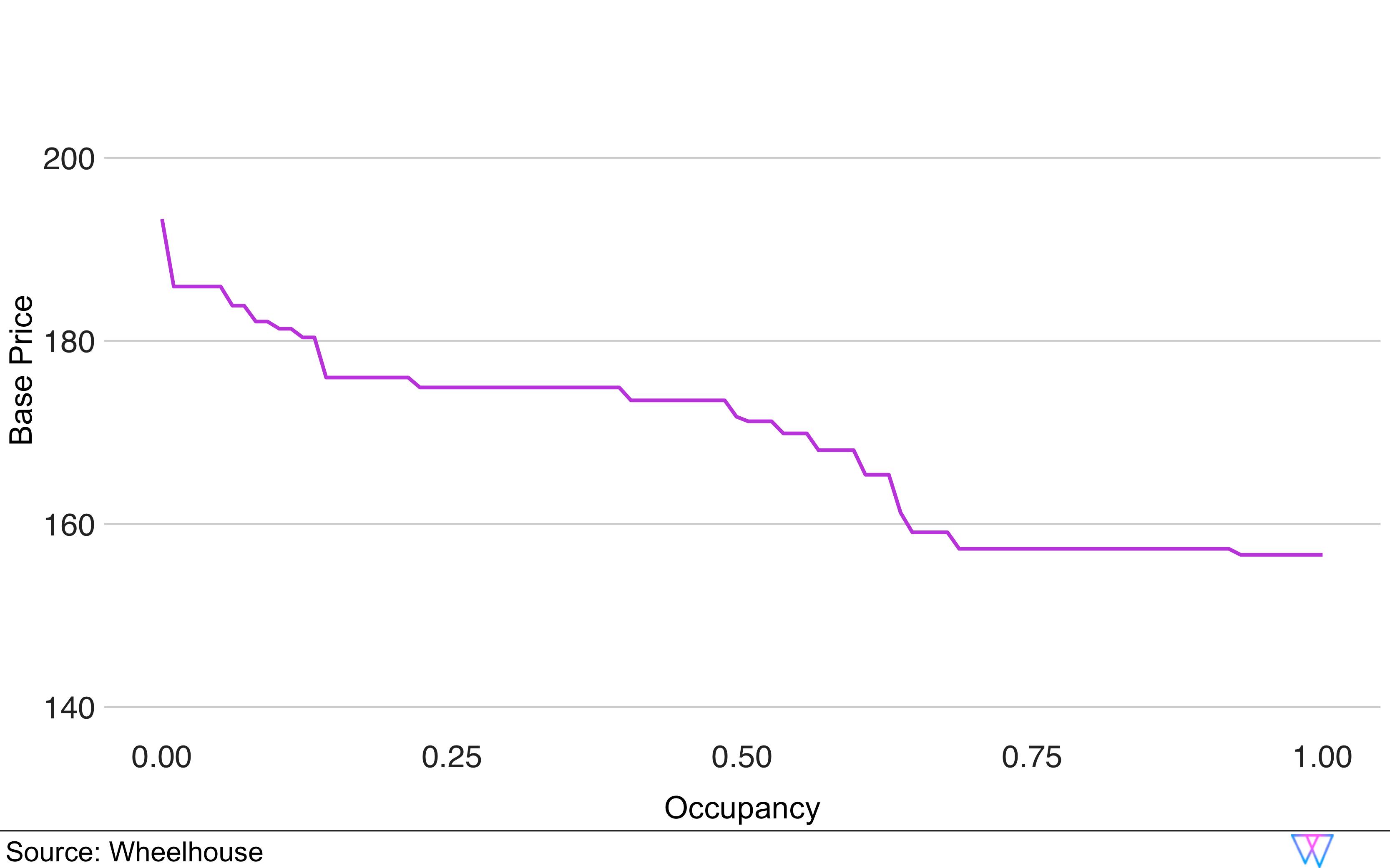
To explore this more, let us examine the chart below, which illustrates the relationship between a unit’s Base Price, and occupancy rates. As you can see, as the achieved occupancy increases, the Base Price associated with these units decreases.
Accuracy evaluation
How we analyze the accuracy of our recommendations
For our model to be effective, we need to avoid overfitting and ensure that the out-of-sample error is minimized. For this, our model uses cross validation during the training process.
In our example of San Francisco, we train the Base Price Model using data from more than 5,000 units through the steps laid out above. A majority of units will have prices close to the right Base Price, while some will be priced too high or too low.
The below image is a histogram chart of a unit’s recommended prices relative to their current median price.
As you can see, most recommendations are pretty similar to the median price, i.e. have a value close to 1.0 (or 100%). However, a few units are currently underpriced and would get a recommendation as high as twice their current price, i.e. 2.0, while others are currently overpriced and would get a recommendation as low as 30% of their current price, i.e. 0.3.
The histogram shows that our Base Price Model
- Reflects the market accurately, i.e. most units are close to 1.0
- Is not biased, i.e. there is a similar amount of outliers to both sides
- Does not overfit to the training data, i.e. the spread of the distribution is not too narrow.

The final output of this model is our “Attributes-Only” Base Price Model.
Now, let’s read about how bookings impact & modify our Base Price Recommendation.
Part 2: Analyzing Bookings
Booking Curves
How our model determines supply and demand
With a Base Price established, we can move on to our next challenge — adjusting nightly prices based on local demand.
Unlike hotels, in the short-term rental space, the vast majority of STR supply is comprised of individual units. These individual units can only be either 100% booked or 100% vacant for a given night. Said differently, for any given night, your unit will either earn some or no money! Adding another degree of complexity to pricing the STR space is that once an individual unit is booked, you can never sell that night again.
Therefore, our model needs to be exceptional at maximizing the expected revenue from your unit, based on a series of ‘binary’ outcomes.
When we started Wheelhouse 6 years ago, our team spent 12+ months testing different statistical approaches to determine which approach could best maximize revenue outcomes, over time.
Today, those early learnings still drive our use of Survival Analysis , specifically the Kaplan–Meier estimator , to create booking curves that power our pricing predictions.
The following graph shows an example of a booking curve created on the entire population of available units in San Francisco, using stay dates between 2015 and 2021. It illustrates how likely an average unit on a normal demand day would be expected to ‘book’.
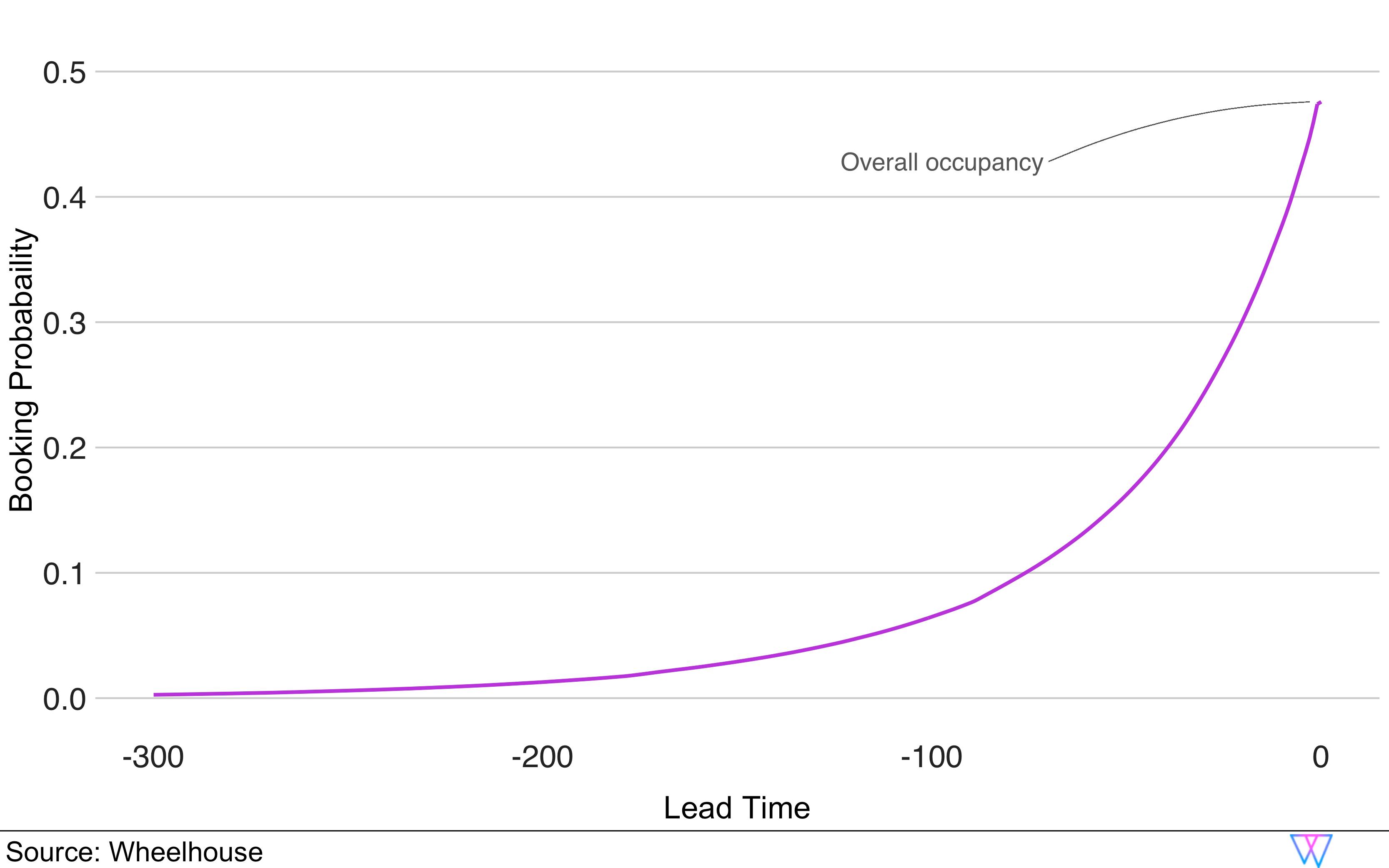
By creating an overall market curve for a normal day, we have an effective benchmark to compare survival curves for any subset of units or stay dates.
This is where our modeling approach becomes particularly powerful, as it enables us to create and compare booking curves for:
- A subset of local units (e.g. a neighborhood, a zip code, any other area)
- A single ‘unit type’, (e.g. tree houses or single family homes)
- A single ‘size’ of units (e.g. 4 bedroom places)
- A single ‘amenity’ (e.g. units with pools, parking, patios, etc.)
- Any single day (e.g. July 7th, New Years Eve, etc.)
- Or… any combination of the above
Comparing these different curves allows us to see, even far in the future, differences in booking patterns.
The next challenge is to translate the differences between two booking curves into a more fine-grained understanding of how these booking patterns will impact expected demand.
To create these projections, our team developed a technique we call Gamma Warping.
Gamma warping
How our model determines demand differences in Booking Curves
Gamma warping is a technique we created to accurately predict future demand based on differences in booking curves.
In the example below, we can see that even 200+ days out, August is booking faster than an average stay date.
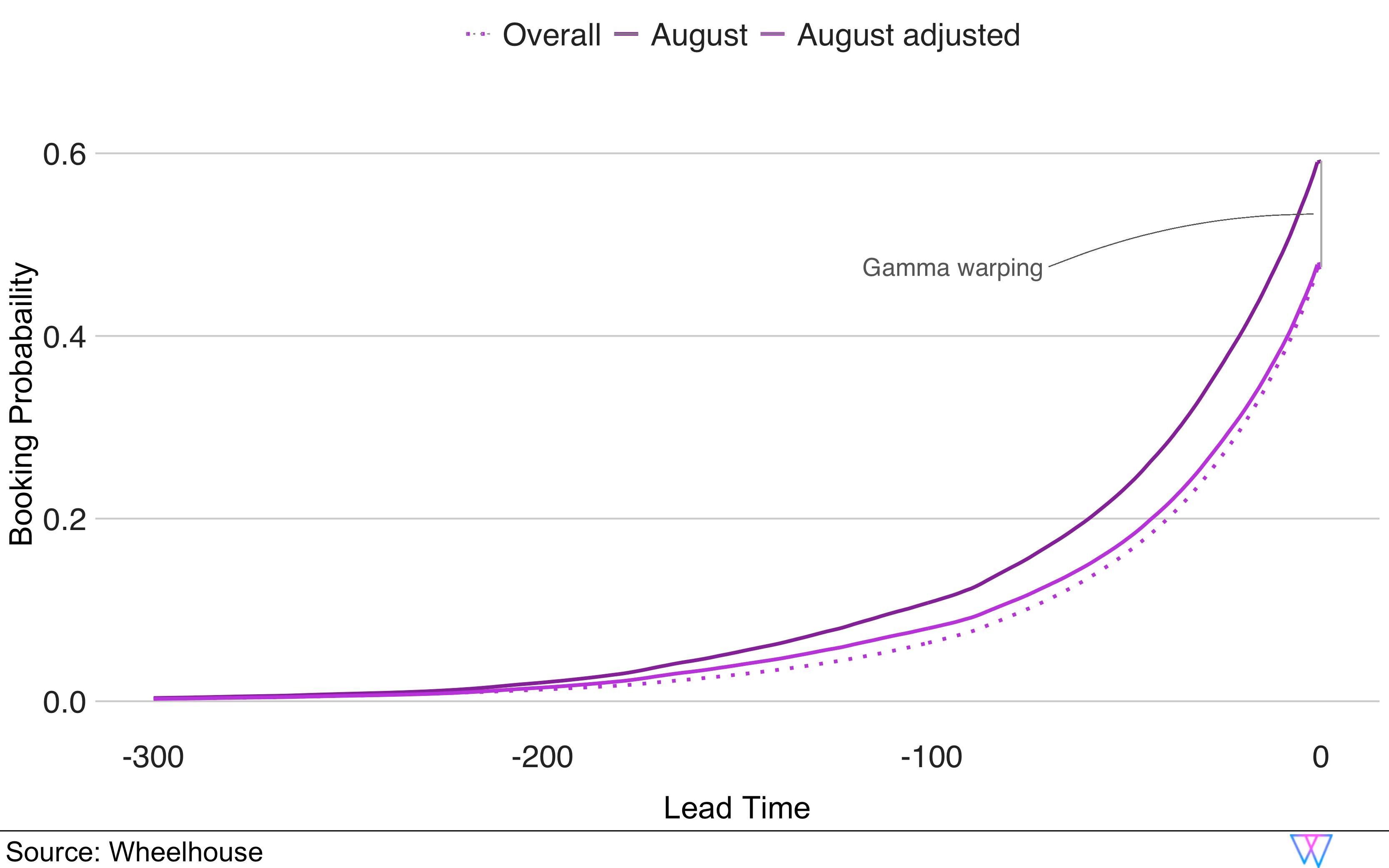
Hence, in general, each stay date in August has a higher booking probability than the rest of the year.
As you can see in the illustration below, our model translates a strong demand signal (or, ‘positive gamma’) into a higher booking probability (y axis) above the baseline booking probability (x axis). However, as the curve additionally illustrates, our model does this in a non-linear fashion (hence why the purple line arches above the dotted line).
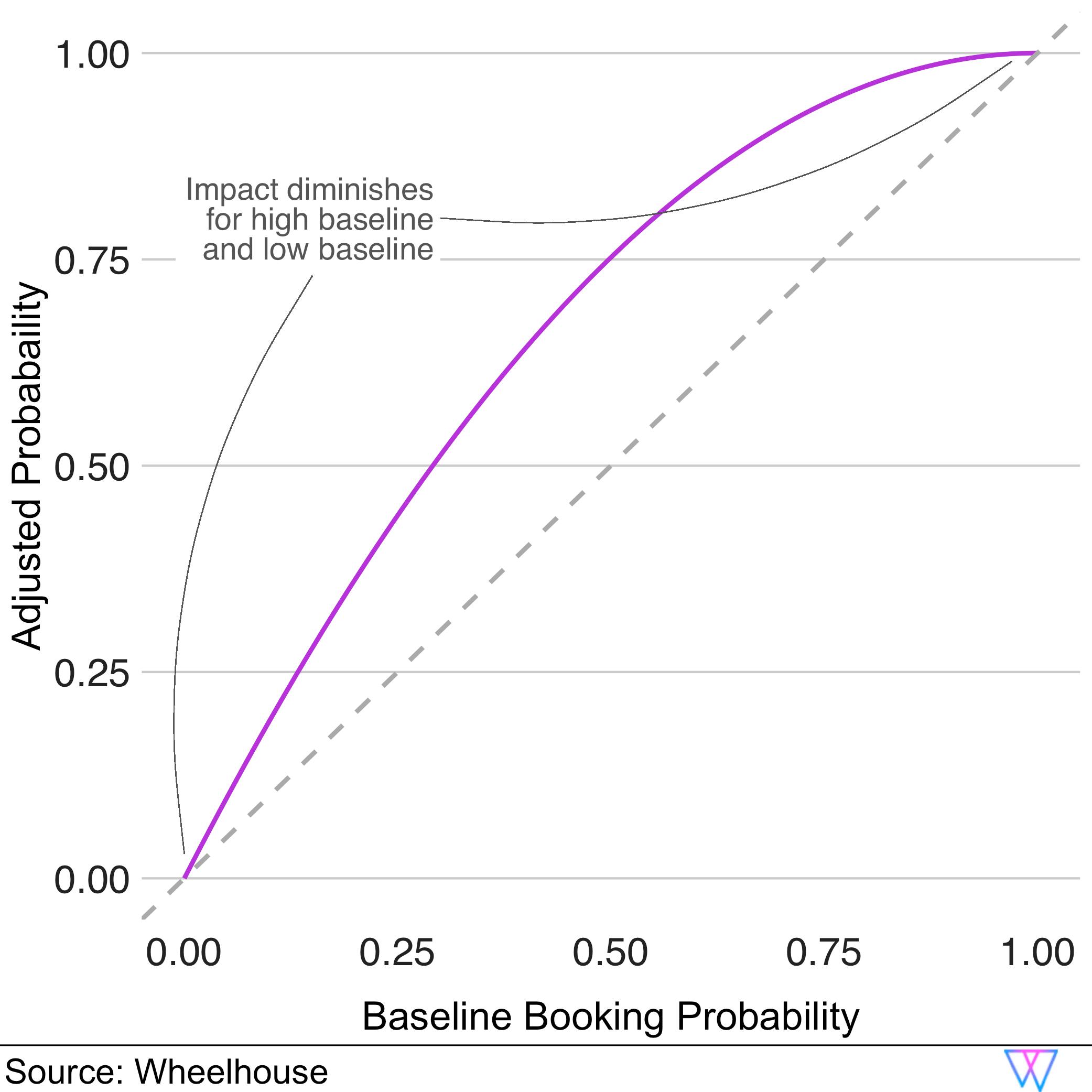
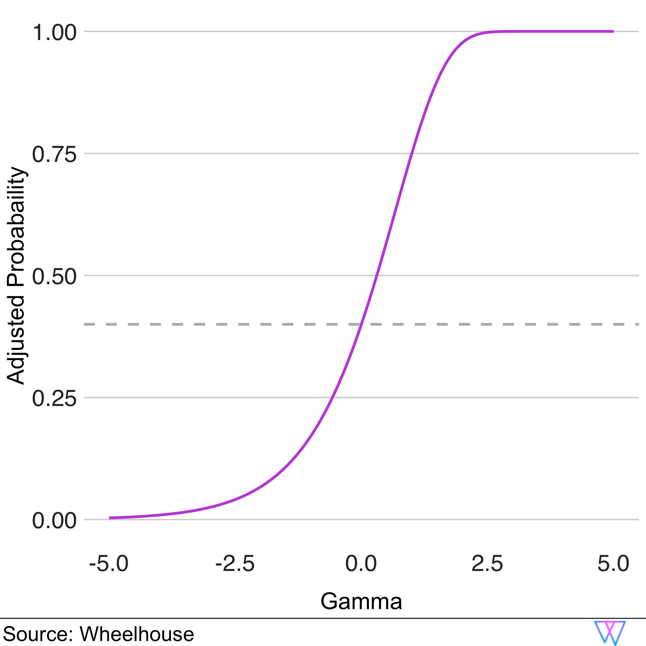
The second example below also illustrates how an initial baseline probability of booking (40%, represented by the dashed line) is transformed by different gamma values.
In illustrating this, we are attempting to show that Wheelhouse’s Pricing Engine responds to differing levels of demand in a very dynamic fashion.
Our model does not simply assume, “Since demand is up 10%, booking probabilities increase 10%, as well”. Instead, on a market by market basis, or for any subset of units, we can create demand curves that help us understand “when demand increases by X% in your market, your unit’s expected booking probability increases by Y%”.
While complicated, it is a very powerful means to generically estimate demand in a dynamic market under a variety of circumstances.
Price response function
How our model translates demand signals into adjusted prices
Our Price Response Function is designed to translate predicted booking probabilities (which we outlined above) into a specific price recommendation for your unique unit.
For example, once we have determined that August is likely to have higher demand, we need to determine how much to increase prices, without dramatically lowering your probability of booking.
From the following graph, we see that as prices increase above our base price recommendation (δ > 0), booking probabilities decrease.
And, no surprise, if prices are below our base price recommendation, we can see that the booking probability increases, at least initially. Importantly though, at a certain point, lowering your prices no longer increases your likelihood to book.
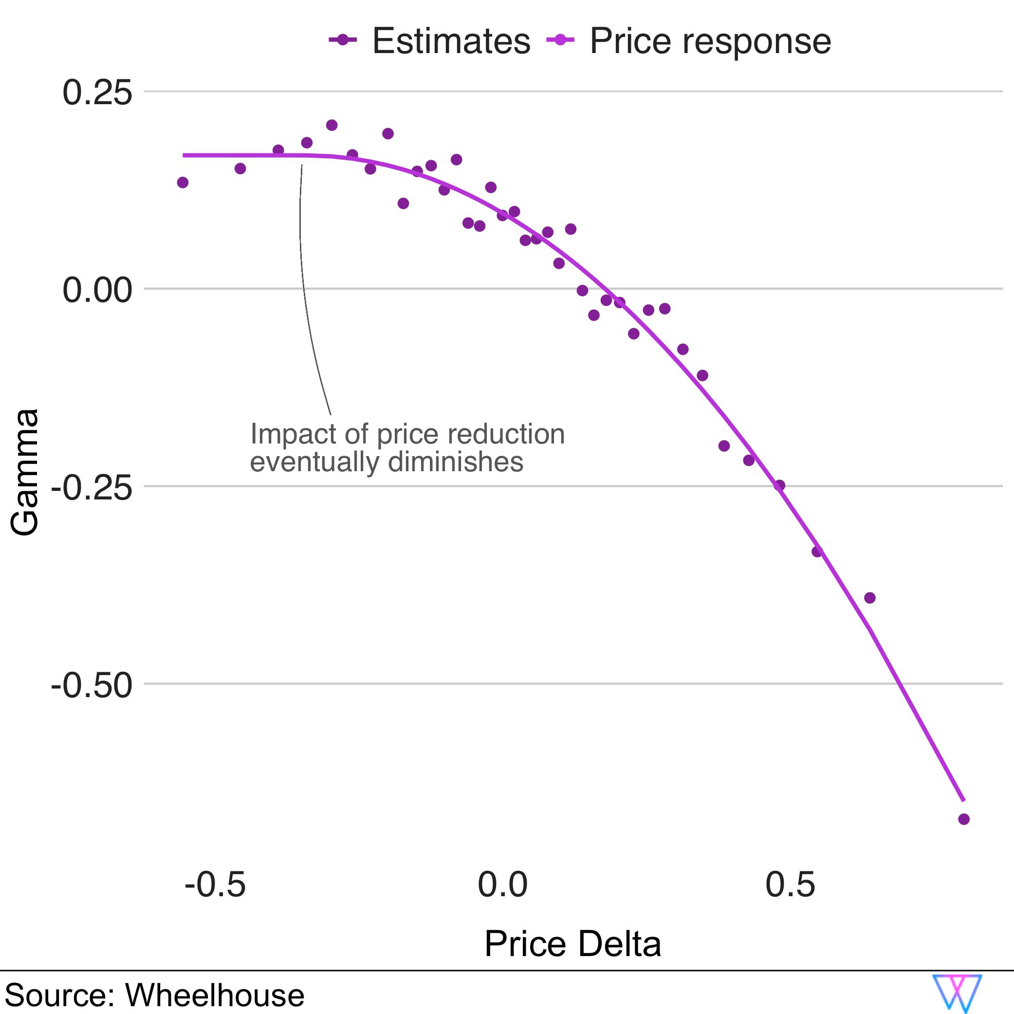
Deriving this price response curve lets us know how to increase prices given a particular ‘expected occupancy’ or demand. We call this value the price multiplier.
In the following graph, you can again see that our price multiplier is not simply linear. In fact, it changes quite dynamically for projected occupancies above or below the baseline (in this example the baseline is still 40% — represented by the dashed line).
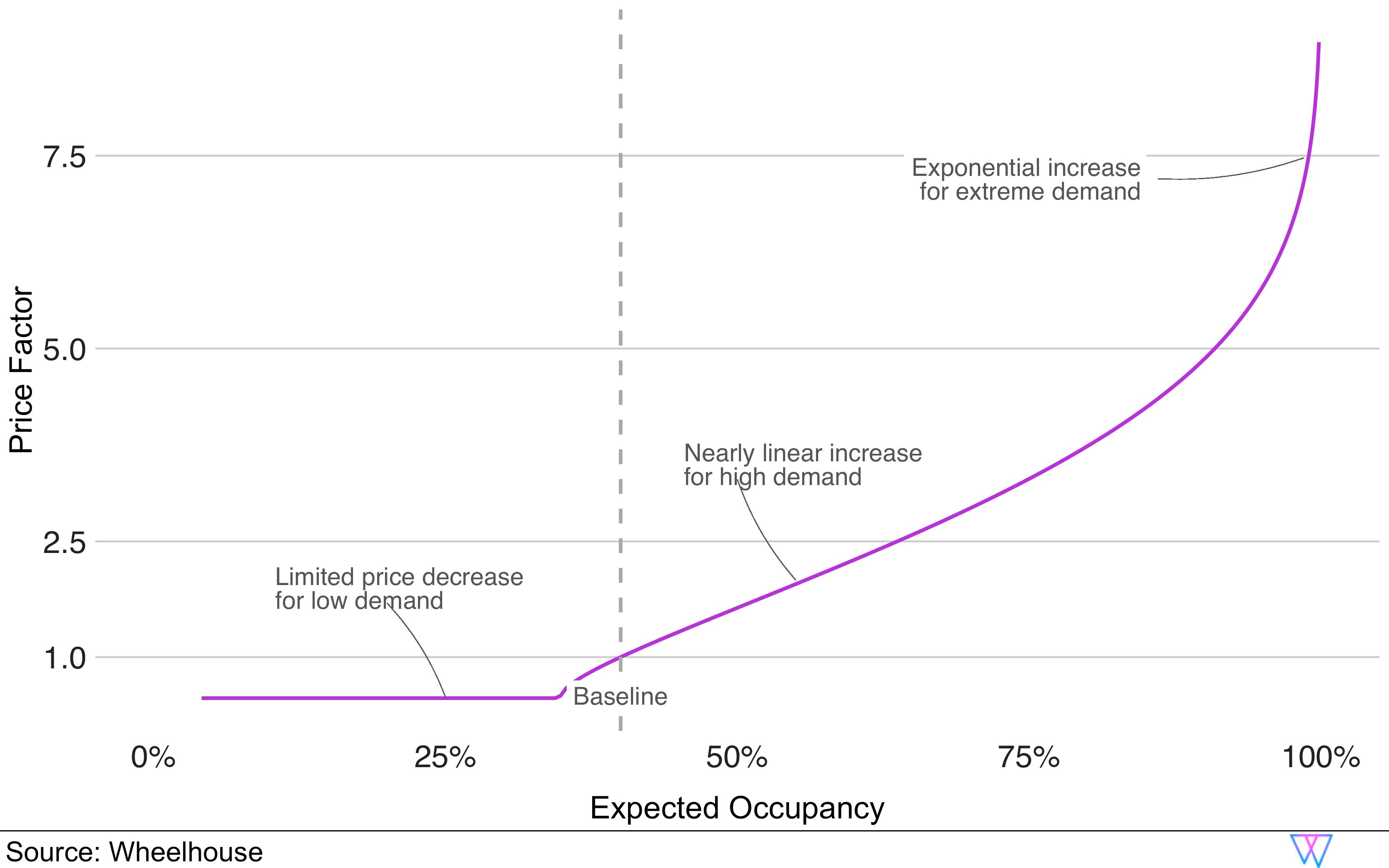
In this chart, we can see that on a day with ‘normal’ demand (i.e. the market occupancy will reach 40%), the price multiplier is 1.0 (or, unchanged). This means that on a normal demand day, the price we would recommend for this day is the same as our Base Price.
However, if the expected demand/occupancy is above the market baseline (i.e. anything more than 40%) our price recommendations would initially increase in a roughly linear fashion, before increasing exponentially during periods of ‘extreme demand’, to better capture market compression. Alternatively, you can see that during periods of low demand, our model will lower prices… but only slightly, and not past a certain point.
Now, with a deep understanding of how our recommendation engine analyzes individual units, their booking probabilities, and the elasticity of their prices, let us dive into how our model begins to understand and predict demand drivers for units, for a particular stay date.
Part 3: Predictive Demand Model
How we leverage pricing data to price your unit accurately in the ‘far-future’
In the pages above, we detailed how Wheelhouse determines the Base Price for each unit, and also how we more deeply analyze and understand both markets and subsets of units.
Now, let’s dive more into how we isolate drivers of local demand, and how we leverage those signals to create far-future price recommendations before booking patterns emerge (e.g. how should we price a unit 365 days from now, when only <1% of a market has booked?).
The first local demand model we employ is our ‘predictive’ model, which is intended to predict accurate prices before a market begins to book. While this model has a number of goals, its most important job is to ensure that we do not underprice units for far future stay dates.
This model is particularly important for the role it plays in pricing local events and holidays that start booking many months (or years!) ahead of a stay date, and offer the best times to capture revenue.
For our Predictive Demand Model, we analyze prices in markets, including future and historical pricing data from hotels and short-term rentals. These pricing signals contain local and historical insights that we can leverage to better ensure the far-future is accurately priced.
Additionally, to aid interpretability and effectiveness, our model can parse these pricing signals, to determine the ‘why’ behind future price increases, so we can better understand factors, including:
- Seasonality
- Day of Week
- Local Events
Let us explore each of these factors in a bit more depth.
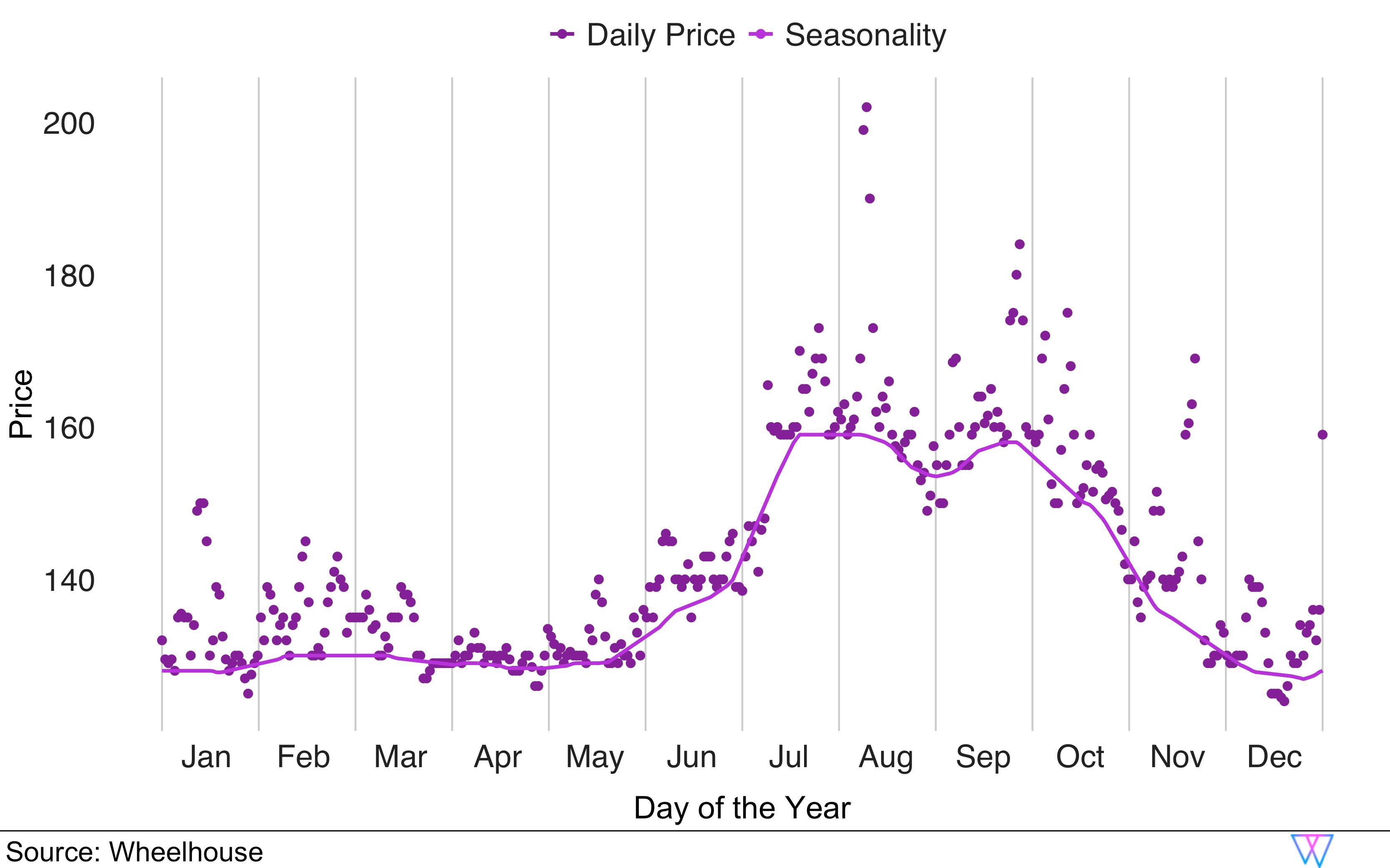
Determining Seasonality
How we extract seasonal patterns from market pricing data
When analyzing a market, our first goal is to accurately determine the ‘seasonality’ of a market. In most markets, this seasonality curve changes slowly from day to day, and has traditionally been pretty stable from year-to-year.
Let us examine a chart that shows the average prices in San Francisco by day of year. In this chart, the dots represent the average price by day of the year. The line shows the output of our custom-designed low-pass filter that extracts the seasonality curve.
Via this method, it is clear that the high season in San Francisco is from July through October, while the rest of the year is relatively flat, in terms of seasonal demand.
Note: Pre-Covid, essentially all markets had a unique, but identifiable seasonality curve, which has been quite stable across multiple years. Post-Covid, it is too early to tell if and when traditional seasonal travel patterns, in the US and other markets, will return.
As of October 2024, we introduced a much more precise listing-specific, Local Seasonality model. Find our published research here.
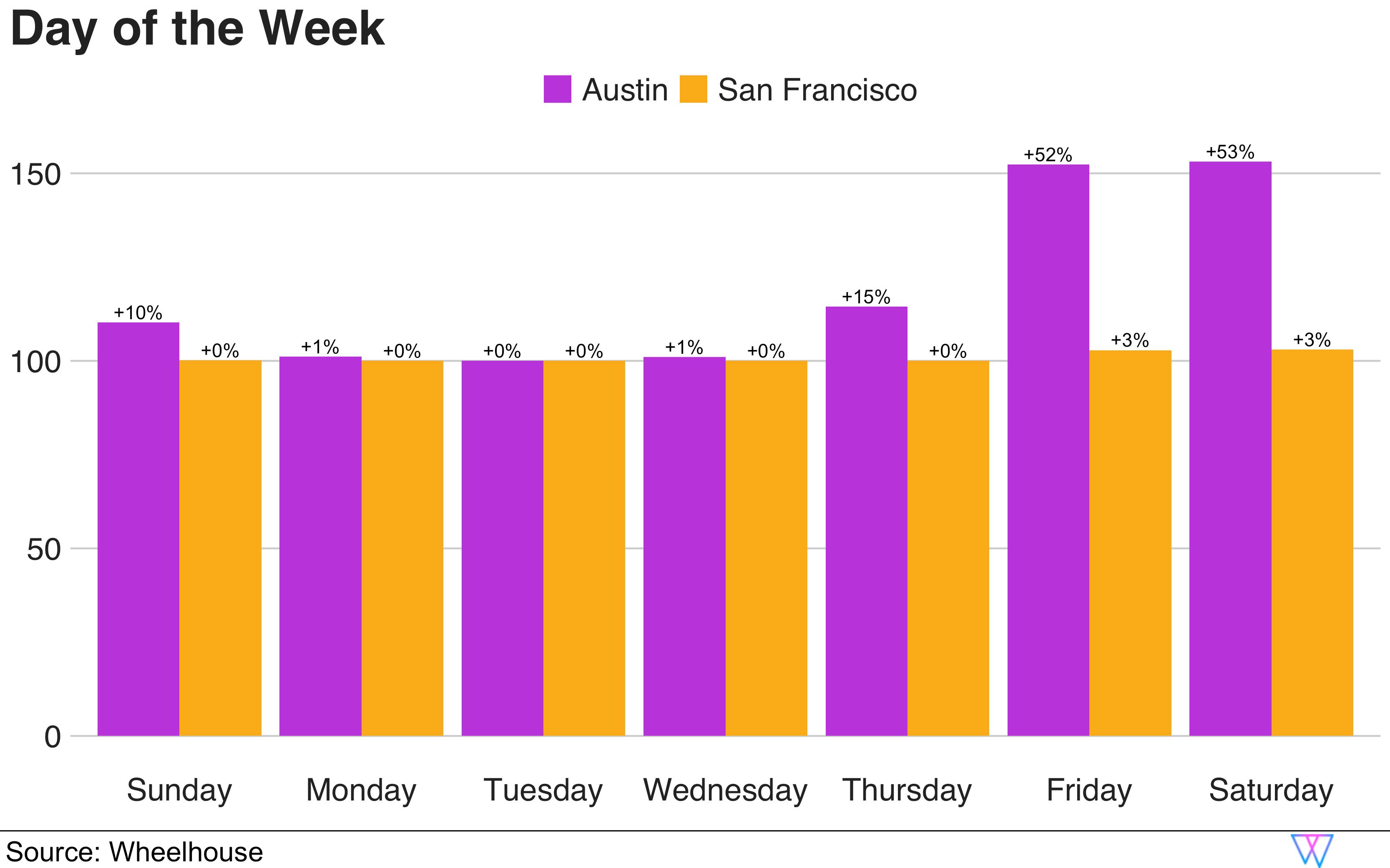
Day of week
How weekday prices differ by market
With a seasonality curve in place, we next want to analyze pricing patterns to discern a regular, repeating pattern around ‘day of week’ pricing. This analysis is particularly important in urban markets that have meaningful business traveler demand, and for leisure markets where we often see bookings for Fridays and Saturdays increase.
To better understand this, let us examine a ‘weekend effect’ as shown in the following bar chart of ‘day of the week’ pricing for San Francisco and Austin. To better compare the two markets, we show the daily prices relative to the lowest price and how much more other days increase above that minimum.
As you can see, San Francisco’s isolated day of week pricing is mostly flat with a very modest weekend increase of 3%. However, Austin clearly shows regular high demand for weekends, with most units increasing prices more than 50% on an average weekend.
By knowing this pattern for each market, we can again more accurately interpret future pricing patterns, and accurately name these factors for our customers.
Local events
How we localize the impact of events
Lastly, our Predictive Demand Model leverages prices to detect local events, in the far future.
While similar to our other two demand ‘filters’, this model additionally considers the location of each event when understanding how particular price signals should be translated to the broader market.
Unsurprisingly, most events only impact pricing for units proximal to the event. However, in most markets there are multiple annual events (e.g. a huge conference, event, or holiday) that are so large they drive price changes across an entire market. Due to this, our model needs to be able to both (a) identify hyper-localized pricing signals and (b) translate those signals into an estimate of the scale and breadth of each event.
We achieve this by analyzing local pricing signals, removing the Seasonality and Day of Week impact, before extracting ‘short’ price increases. These results are achieved via a custom designed high-pass filter. The result of this filter is a highly readable chart that allows both our team (and you!) to examine any market for event-driven demand.
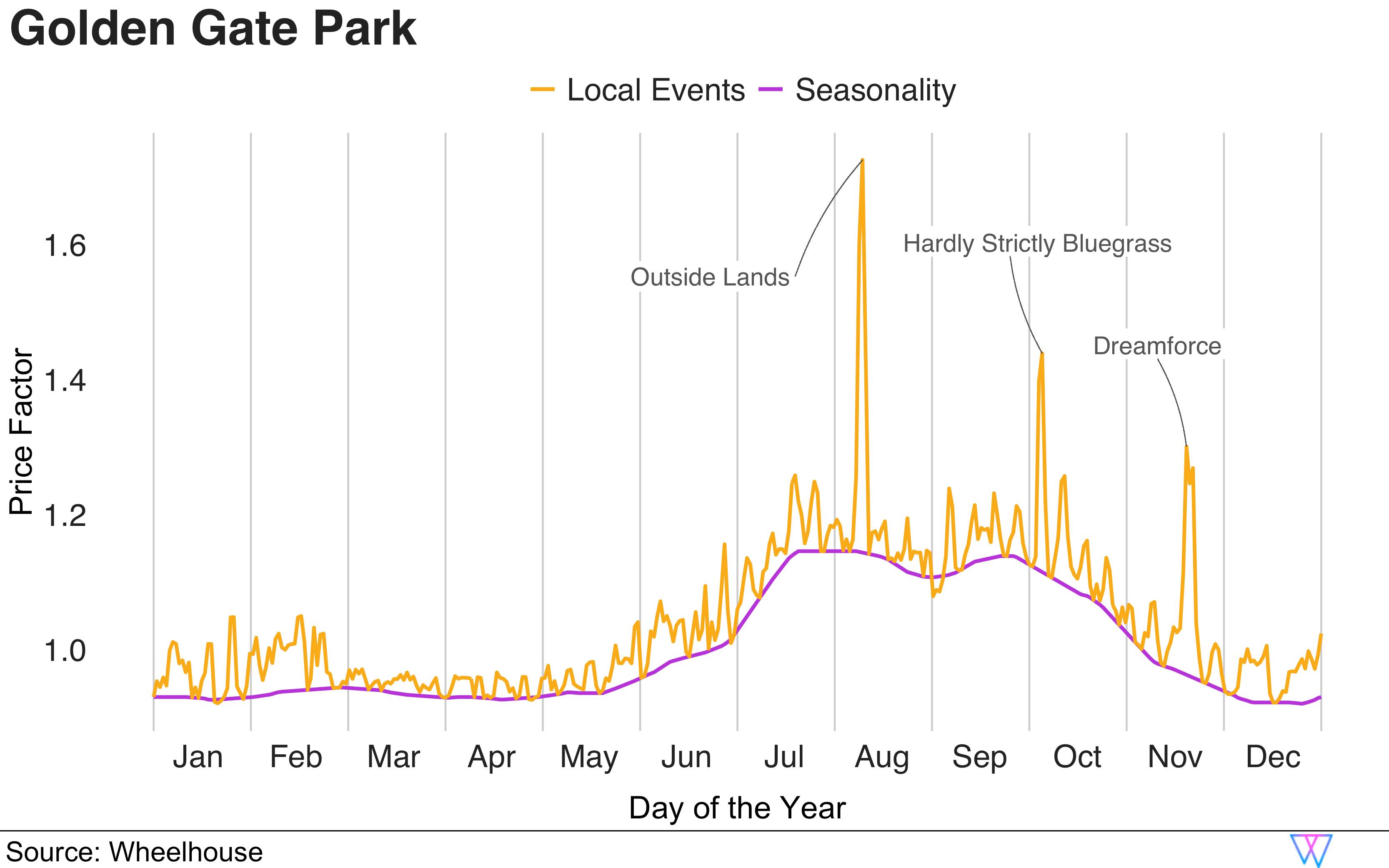
As an example, let us examine what our model determined to be the ‘event impact’ for two different areas in San Francisco, Union Square (near downtown) and Golden Gate Park (4 miles from downtown, a popular concert area). (Note that these are projections only from our Predictive Demand Model, as of January 2020. More on this soon!)
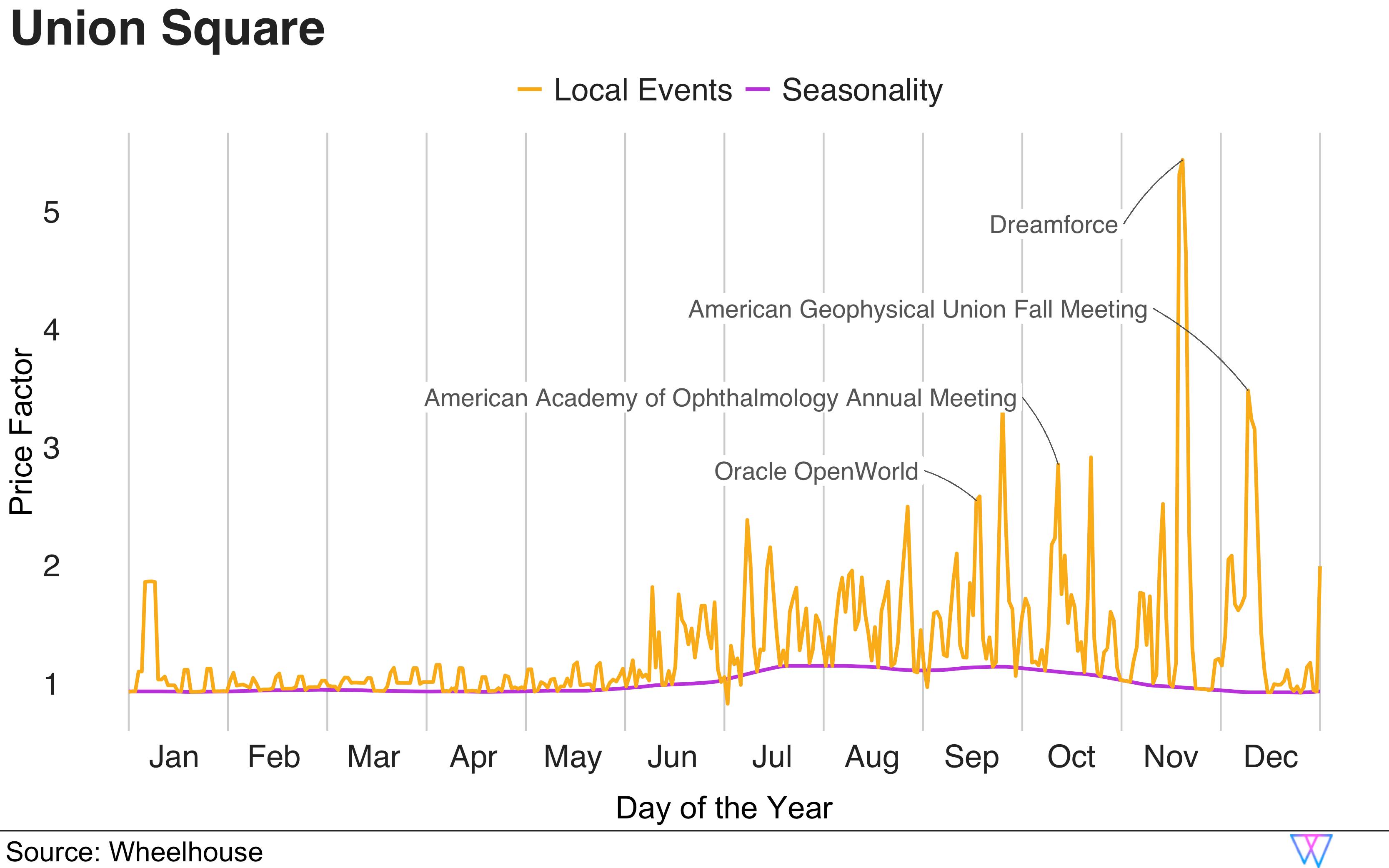
In the first chart (above), we see event-driven demand in the Union Square neighborhood, which is very close to the Moscone Convention Center. Therefore, we see our Predictive Model reacting very dynamically over the year, and ultimately dwarfing the relatively small seasonality impact in this area.
However, in the second chart (below), we examine units near Golden Gate Park, 4 miles from downtown. In this chart, we can clearly see that the biggest events were projected to be the two music festivals — Outside Lands and Hardly Strictly Bluegrass. These events do not impact the downtown area. And, only Dreamforce, the largest of conferences, can be definitively tied to a specific price spike in the Golden Gate Park area.
Importantly, our model is also able to leverage this signal to predict when significant demand is going to spill over into other neighborhoods, albeit at a smaller price multiplier.
Part 4: Reactive Demand Model
How we leverage booking signals to price your unit accurately for actual demand
As we all know, market conditions change daily, and sometimes dramatically.
In the accommodations space, as stay dates approach, we are able to observe more bookings, and gain a more concrete understanding of demand. (While much of the accommodations space still leverages historical data to inform all pricing, we leverage actual bookings.)
Similar to our Predictive Demand Model, our Reactive Demand Model attempts to determine both how much and why demand is shifting. On a daily basis, our model re-analyzes your market, leveraging our prior referenced Booking Curves and Gamma Warping to re-forecast these three main demand drivers — seasonality, day of the week, and local events.
For a very visual example of this, let us look at our reactive demand model for downtown San Francisco, as calculated on January 1, 2020 (purple line) and March 15th, 2020 (yellow line).
As you can see, as of January 1st (purple line), our reactive demand model was projecting large demand spikes for many events in San Francisco, including Dreamforce, a huge annual event in October, in San Francisco.
However, by March 15th, you can see that event demand for Q2 (April — June) has essentially completely evaporated. Therefore the prior forecast price increases have either completely disappeared or become much more muted.
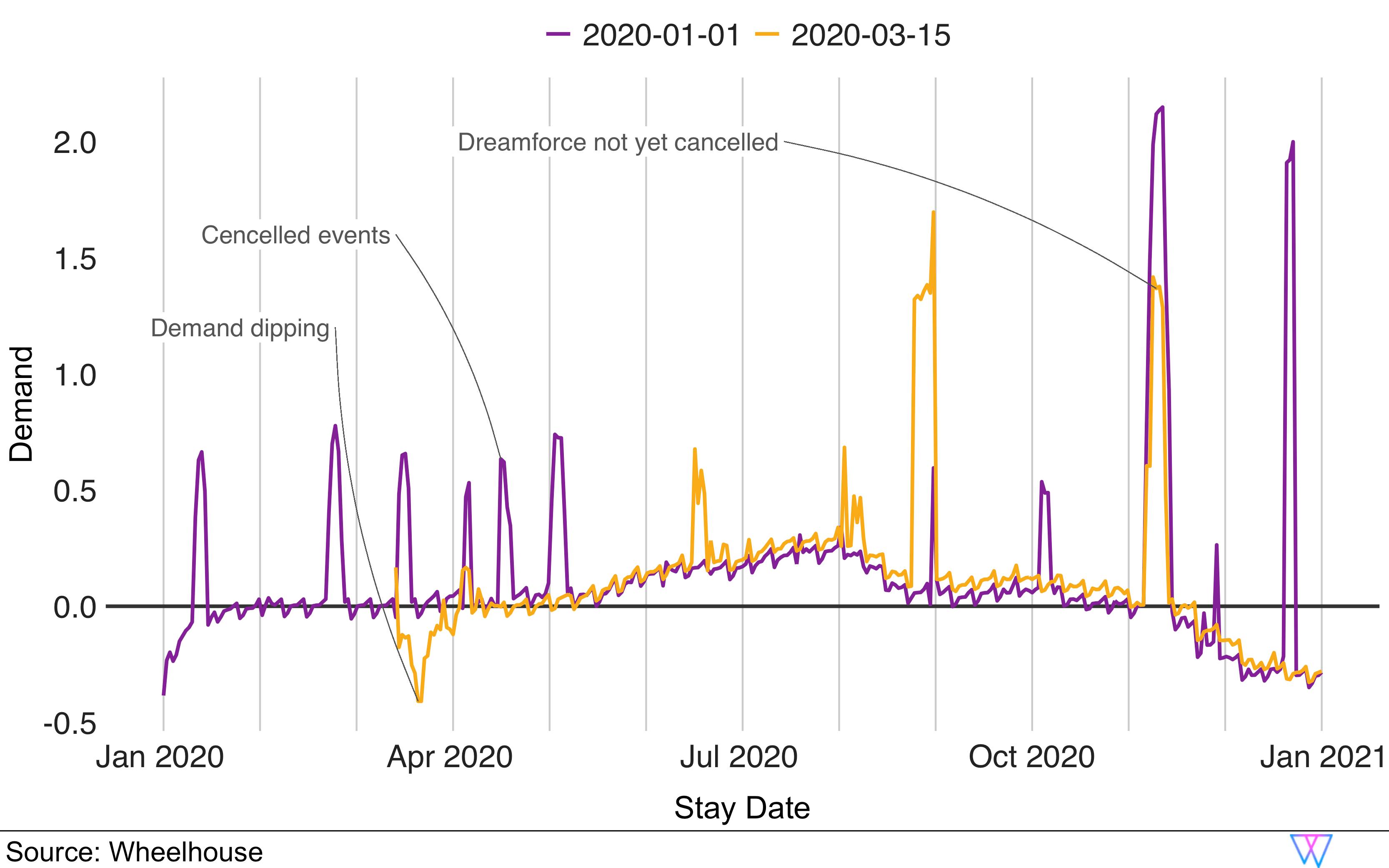
Of interest, we can also see that demand for events in Q3 had not yet fallen off a cliff. Market uncertainty is clearly visible, as we can see the demand around Dreamforce has dropped precipitously. Of course, in reality, it only got worse from here. But, this is an interesting snapshot that shows our model capturing near term changes, but not blanket-applying those patterns to a total market selloff, yet.
This output is exactly what we would expect from our Reactive Model. The model’s recommendations are entirely driven by market behavior, not speculation or historical assumptions.
Part 5: Blending Demand Models
How our models are blended so each day is more accurately priced over time
In illustrating our Predictive and Reactive Demand Models, we were attempting to show that our pricing engine creates and utilizes two estimates of future demand, daily. The reason we have these two models is that we need to both (a) infer projected demand before it emerges, and (b) respond to actual demand, as stay dates approach and booking patterns emerge.
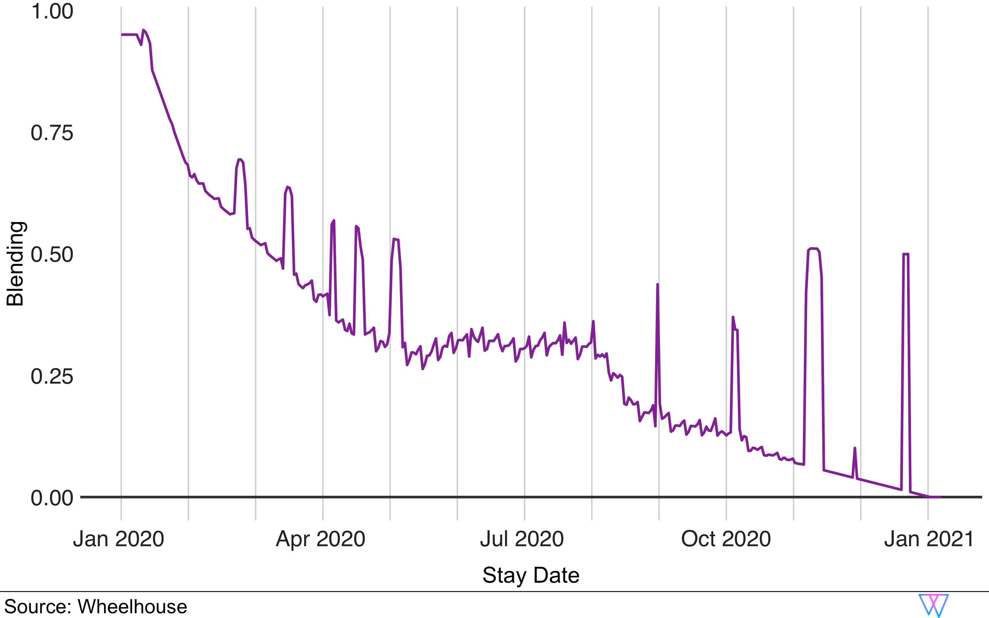
We leverage these two models for each day’s recommendation by dynamically blending the demand models together.
On the chart below, we show stay dates on the x-axis, from today (far left) to 365 days out (far right). On the y-axis, we show the weighting (from 0% to 100%) that our Reactive model has for any future stay date. The reason the curve slopes up (from right to left) is that as a stay date approaches, our Reactive Model starts to have a much bigger impact on that day’s price recommendation.
Additionally, the spikes you see in the line show where a large number of bookings cause our Reactive Model to be more heavily weighted sooner than normal. Said differently, when we see a big demand spike and have high certainty that this is a clear market signal, our model very quickly responds to that demand.
Part 6: Calendar Controls & Response
How Wheelhouse adjusts pricing around bookings & approaching vacancies
The manner in which hosts and operators control their booking calendars can significantly impact a unit’s likelihood to book, and therefore one’s pricing strategy and expected revenue.
There are two key aspects of calendar control that impact revenue:
- Vacancy gaps i.e. a single, or multiple nights, trapped between two bookings
- Temporality i.e. how many days remain open, a certain number of days before a stay date
We are going to explore both of these, to help illustrate how the decisions you make around the bookings you accept can impact your expected revenue.
Vacancy gaps
How limited availability can impact your likelihood to book
Vacancy gaps are short spans of nights for a unit where the nights before and after the stay date(s) are booked or blocked. For many short-term rentals, these short vacancy gaps have a much lower likelihood to book. This is illustrated in the following analysis of vacancy gaps in the San Francisco market.
In San Francisco, single night gaps have a probability of only 7.3% of being booked, compared to a normal day in the market, which has a booking probability of 41.1%. As this ‘vacancy gap’ gets larger (i.e. two or three nights) the booking probability for these days increases.
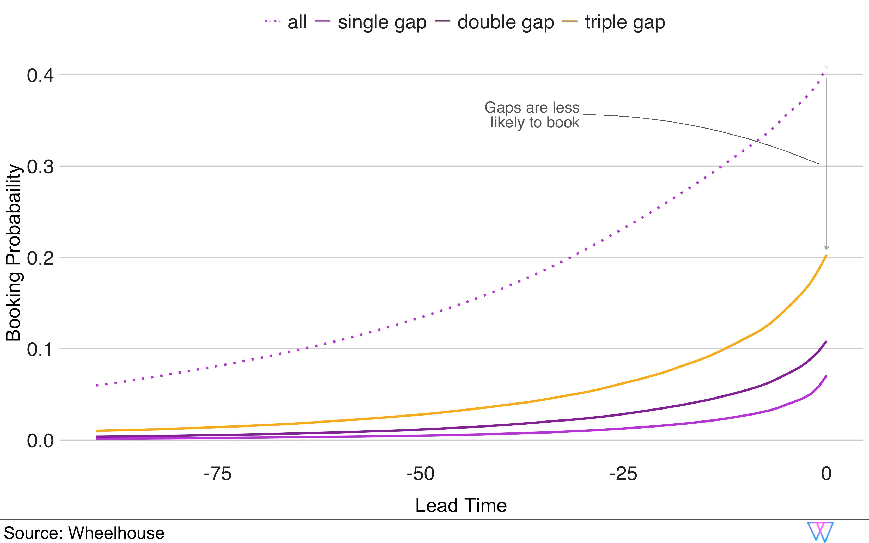
However, the probability of booking is also correlated to which day(s) of the week are available. For example, in San Francisco a double night gap on a weekend (i.e. Friday and Saturday night) has a 5.4% higher chance of getting booked, as opposed to two weekdays.
Thus, our pricing engine uses a combination of the vacancy gap length and the day of week to determine an appropriate discount for any vacancy gap that emerges on your calendar.
On a daily basis, our model is reviewing each unit’s calendar, to try to maximize revenue while respecting minimum stay rules and the calendar blocks that customers control.
Last minute pricing
How we adjust prices to help you capture last minute bookings, at the right price
In the short-term rental market, there is a tendency of hosts and owners to apply last minute discounts as a stay date approaches. In many markets, we observe this discounting schedule to be much more aggressive than what we see for hotels.
For example, let us look at the graph of how operators discount prices over time, as a stay date approaches. As we can see here, about two weeks before the stay date, average booking prices start to drop until they have dropped by almost 30% for same-day bookings.
While this varies by market and unit, Wheelhouse incorporates discounting schedules into our price recommendations as a ‘temporality adjustment’, which dynamically reduces the price as the stay date approaches.
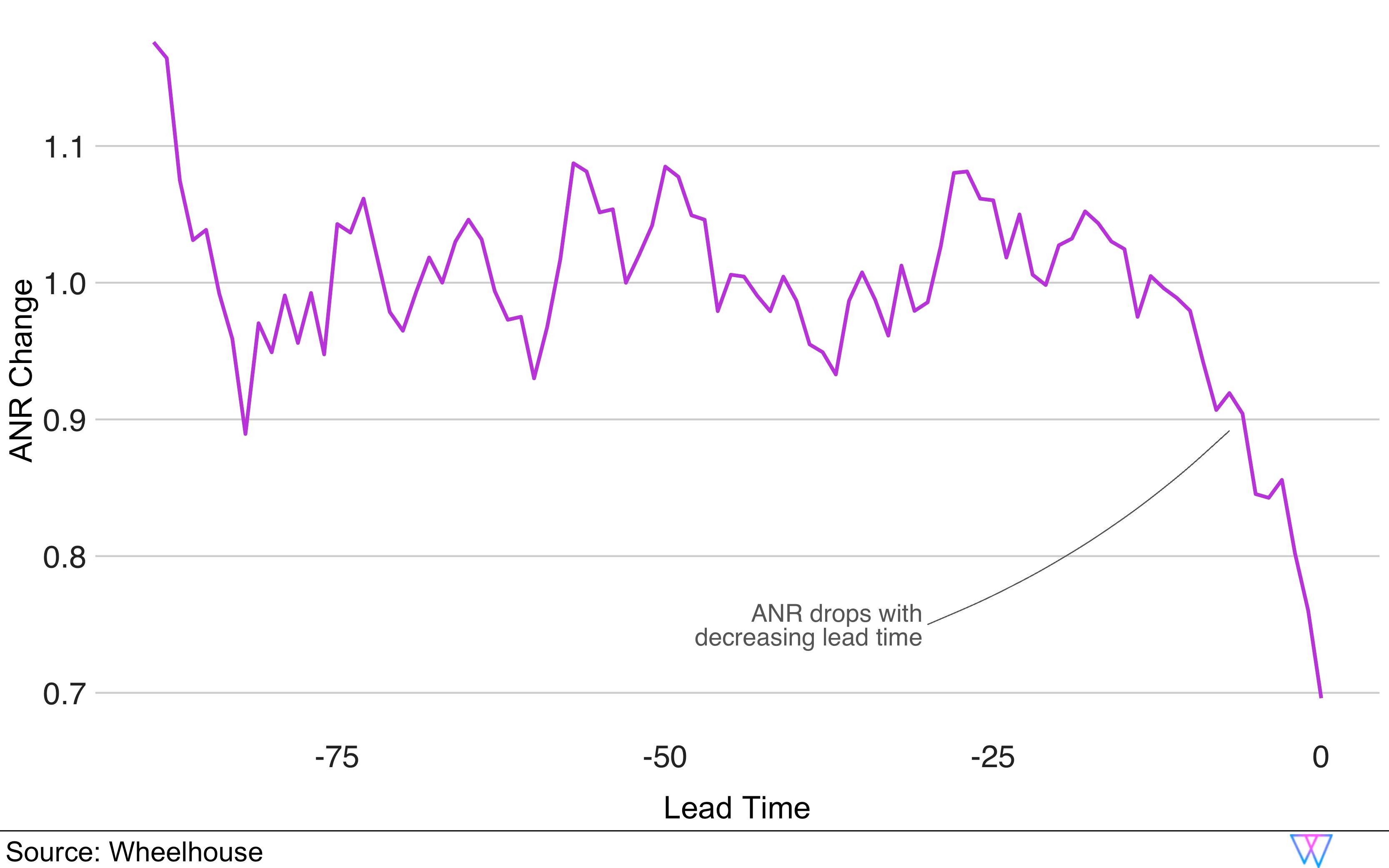
We should note that many users choose not to discount their prices as stay dates approach. On Wheelhouse, much like with every other aspect of our model, you can either (a) choose an automated setting for your unit, or (b) fully customize your last-minute discounting strategy, in any way you please.
Part 7: Dynamic Pacing Model
How groups of units can be leveraged to perfect pricing over time
While the last-minute discounting strategy detailed above works well for individual STR units, we have learned that for multi-unit properties (hotels, or premium STR buildings), an effective pricing strategy requires a much different approach.
To handle increasingly professional portfolios in the STR space, the Wheelhouse Pricing Engine developed the concept of ‘unit types’. Unit types help properties with similar rooms (such as multiple studios, 1BR, 2BR, 2BR/2BA, etc.) to leverage a ‘portfolio’ approach to pricing. Similar to how hotel pricing works, this approach allows us to make pricing decisions based on the performance of a set of units.
In the graph below, we illustrate the risk-reward ratio changes as a set of rooms begins to book. In this scenario, let us analyze a boutique hotel that has 10 units in a particular unit type.
Before the first booking occurs, the risk of a low daily revenue figure is high. Consequently, increasing prices prior to a first booking also increases the risk of the ‘worst case scenario’ — $0 in daily revenue. Alternatively, if 9 of the 10 rooms for a stay date are already booked, the marginal risk of increasing the price for the last unit is much smaller. Therefore, as more of a property books up, the more aggressively we can potentially price the remaining available units
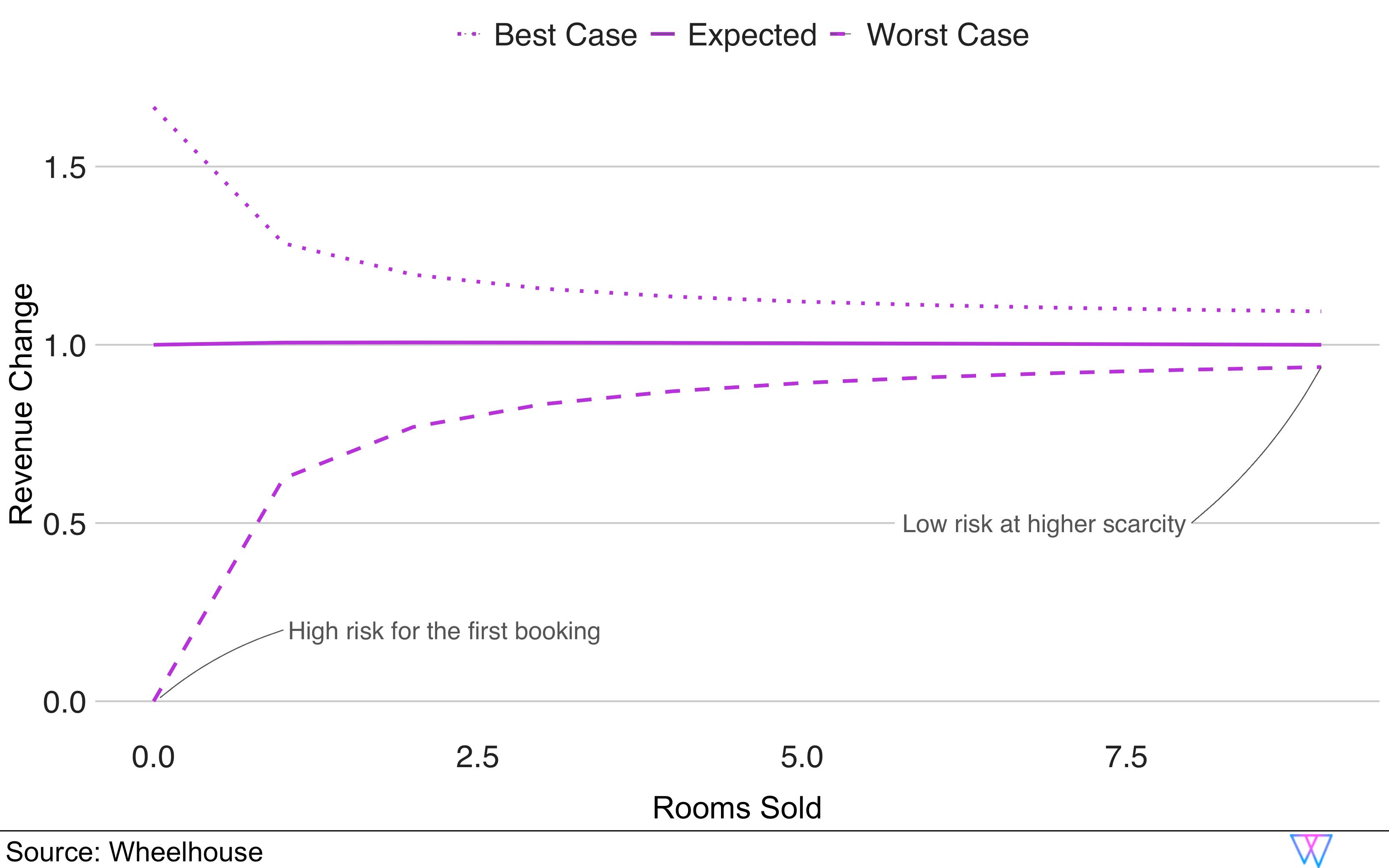
When we tested our pacing model on our portfolio through A/B tests, we observed an ability to drive revenue at a building level up by 0.9% to 1.5%. While seemingly small, impacts like this, in aggregate, are the foundation of our model’s success.
While one of our newer innovations, we are confident that Wheelhouse has developed the only dynamic pacing model in the STR category. We look forward to continuing to refine this, especially with our urban STR partners.
Conclusion
Thank you for reading more on the many unique components behind the Wheelhouse Pricing engine. In the above pages, we have detailed how our model can:
- Understand each unique unit
- Understand each local market or neighborhood
- Maximize revenue outcomes for single units, or portfolios of units
- Maximize revenue in urban, rural and vacation destinations
- Maximize revenue in high density unit clusters, and highly spread out units
- Adapt over time to the unique performance of each unit
With these insights in hand, we hope you feel well equipped to leverage or modify any aspect of Wheelhouse’s pricing strategy, to more perfectly drive your business’s needs and goals.
However, we recognize that despite all the effort we put into our pricing engine, the true success of Wheelhouse depends on you. No pricing engine is complete without a skilled operator (you!) modifying our recommendations to better capture your unique business goals.
Therefore, while we love improving our model, know that our team continues to invest just as much time and energy into designing a user-friendly interface, that gives you access to a wide degree of customizable settings and strategies. This effort ensures that you always have the final determination for how to price your unique portfolio.

And lastly, should you have any questions about Wheelhouse — either our product or our pricing engine — just know that our team, especially our best-in-class support team, are ready and eager to help!