How Wheelhouse determines the right set of comparable units


Updated May 23, 2023
Similarity in space
How attributes are transformed to similarities
In order to understand similarity, we need to transform the raw attributes (like number of bedrooms, room type, location, etc) into a different form in which a comparison is more adequate. A potential guest usually looks at four important factors (and their trade-offs) to make a decision:
- Unit - Do the attributes and amenities meet the requirements?
- Host - Does the host meet trust and quality expectations?
- Price - Does the price meet the budget?
- Location - Does the location fit the travel plans?
Attribute Impact
As discussed above, the attributes of a unit or a host are hard to compare directly. However, we have a way to measure the similarity of unit attributes through the Base Price Model. If the attribute is less important to guests as a differentiator, the impact on the average booking price will be low. At the same time, attributes that matter a lot for the decision will significantly change the price guests are willing to pay.
Next to the unit itself, it is important how the unit is managed by the host and how guests are perceiving the unit and are willing to book it. To capture this factor, an Occupancy Model is formed which is trained in a similar fashion as our Base Price Model. In this case it predicts the occupancy of a unit rather than its price and hence reflects both the host performance and the guest impression.
The Occupancy Model is then used just like the Base Price Model as a similarity measure to compare the booking performance of different units.
Distance Measure
For the final distance measure between two units, we combine the predicted base price, the predicted occupancy, and the geographical distance. To be considered as part of the automatically detected Comparable Set, the total relative difference in predicted base price and occupancy between two units is required to be below a threshold.
The threshold is relative to the local density of units to reflect the choices a potential guest has. If a location has only few units to offer, the Comparable Set is a little more lenient, just like a guest would be less strict about attributes with limited supply. Vice versa, in a dense area with a lot of units, the set will be more strict to pick the most similar units.
In addition, units are only considered as comparable if they are not too far away geographically. Again, the threshold depends on the market as well as the local unit density. A rural market will usually consider larger distances than an urban market and sparse neighborhoods will be more lenient than dense areas with many units.
Note: Keep in mind that the desirability of specific neighborhoods is already implicitly covered by the Base Price and the Occupancy Models. See our section on spatial kriging for more details.
Example
To explore this Comp Set model, let us take a sample ‘private room’ in downtown San Francisco, with zero bedrooms, i.e. a studio, and one bathroom that sleeps two.
Overview
In this case, our Comp Set model identifies a comparable set of 90 units. Among this comparable set, 68 units are also zero bedrooms, while the other 32 have one bedroom. And, while 74 of the units are also classified as ‘private rooms’, 16 of the units are entire homes/apartments.
The results are shown in the following visual, which depicts each nearby unit as a singular dot.

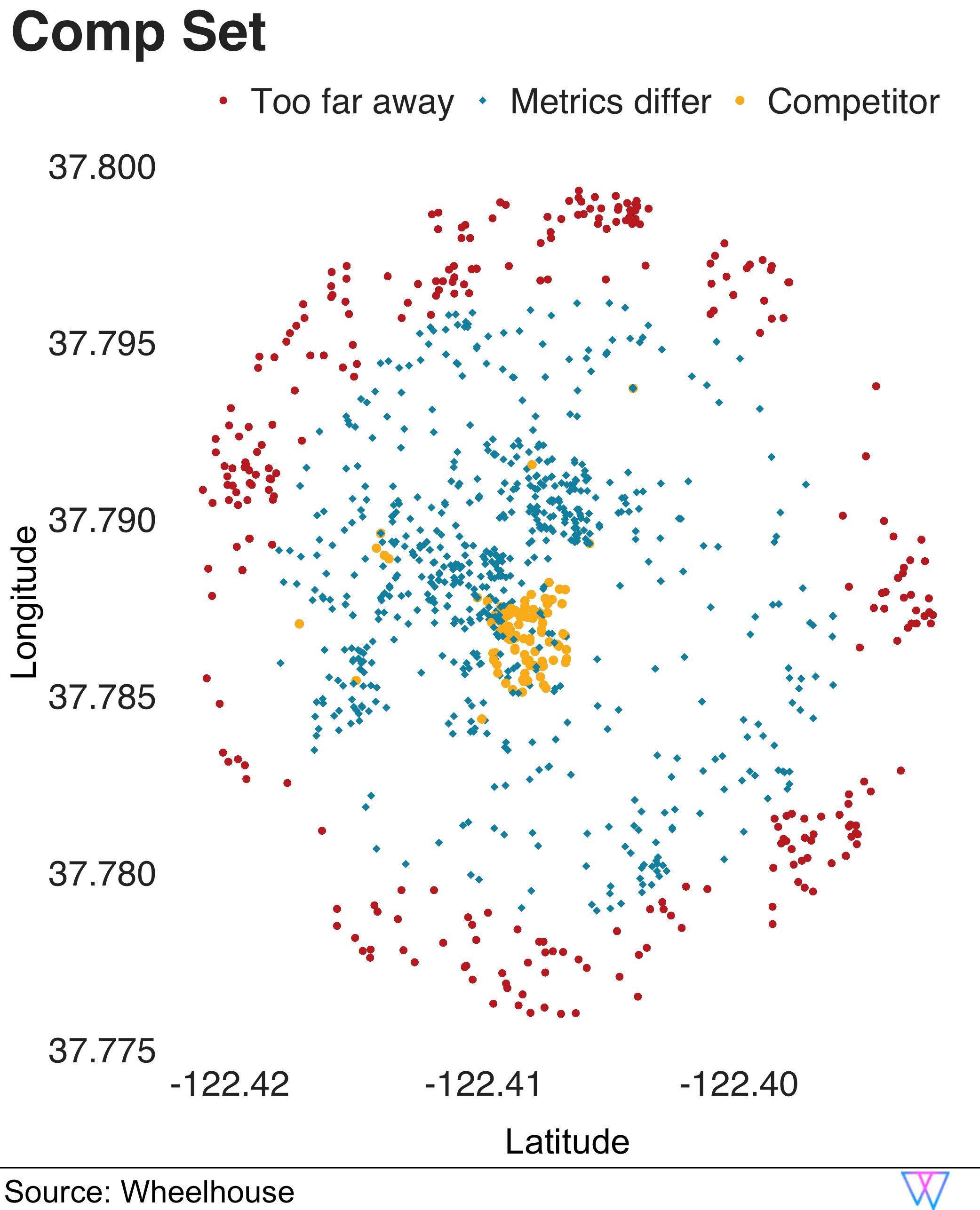
As you can see, some of these nearby units are considered too far away, geographically, to be truly comparable (these units are the ‘red circles’).
For the next set of more proximal units, our model removes units for which the base price and the expected occupancy do not align (these units are the ‘blue squares’). However, when both distance and similarity are a ‘match’, our model includes this unit in a default ‘comparable set’ (yellow circles, clustered at the center).
Pretty cool! But… ready to dive in even deeper?
Distributions
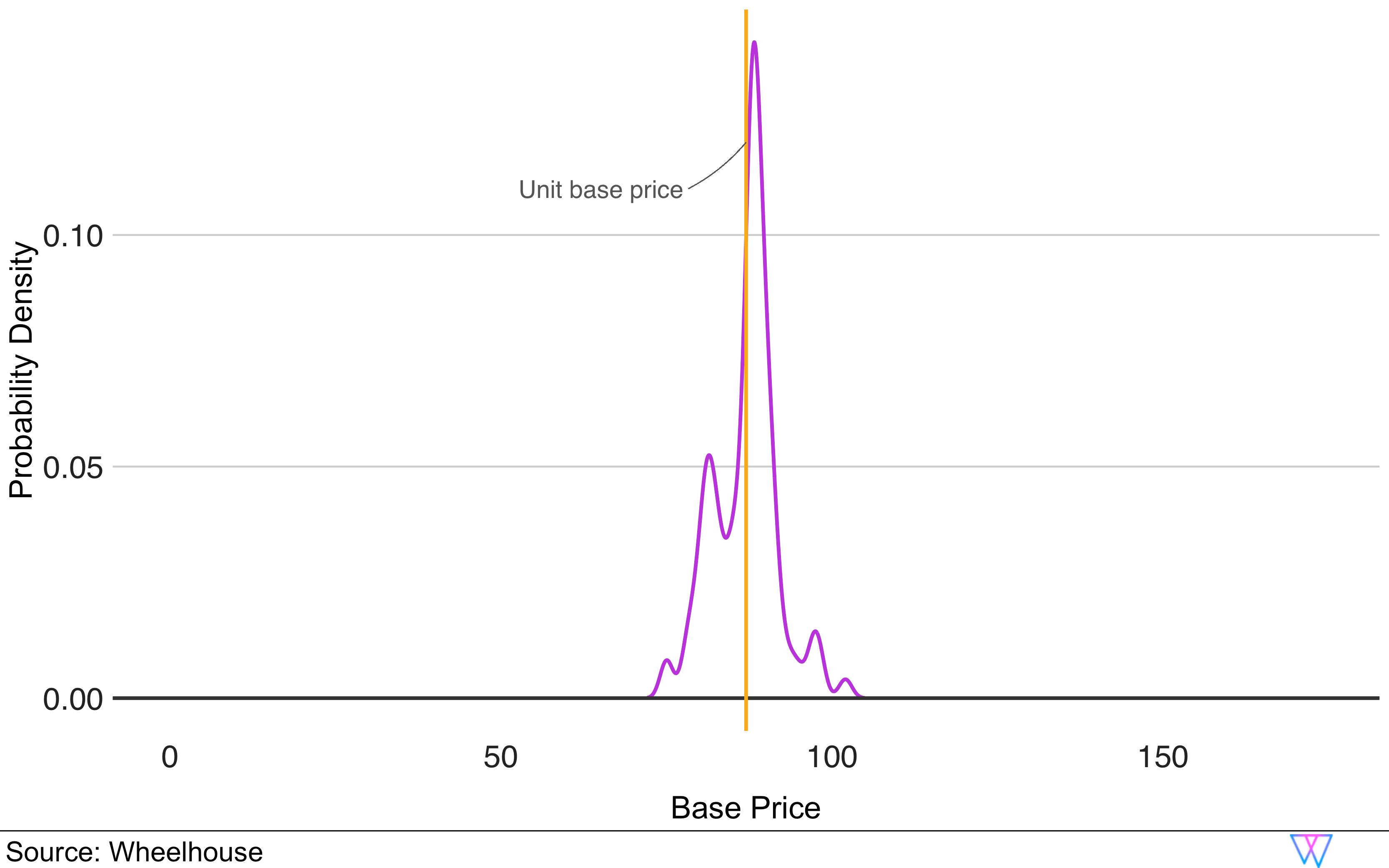
Let us further our comp set analysis by examining the distribution of the two key metrics, base price and occupancy, for the identified comparable units. As we can see on the first chart, our Base Price graph shows where, amongst a comp set, this unit’s Base Price falls. In the second chart, we can see that the distribution around occupancy is actually considerably broader, though still similar, to our sample unit.

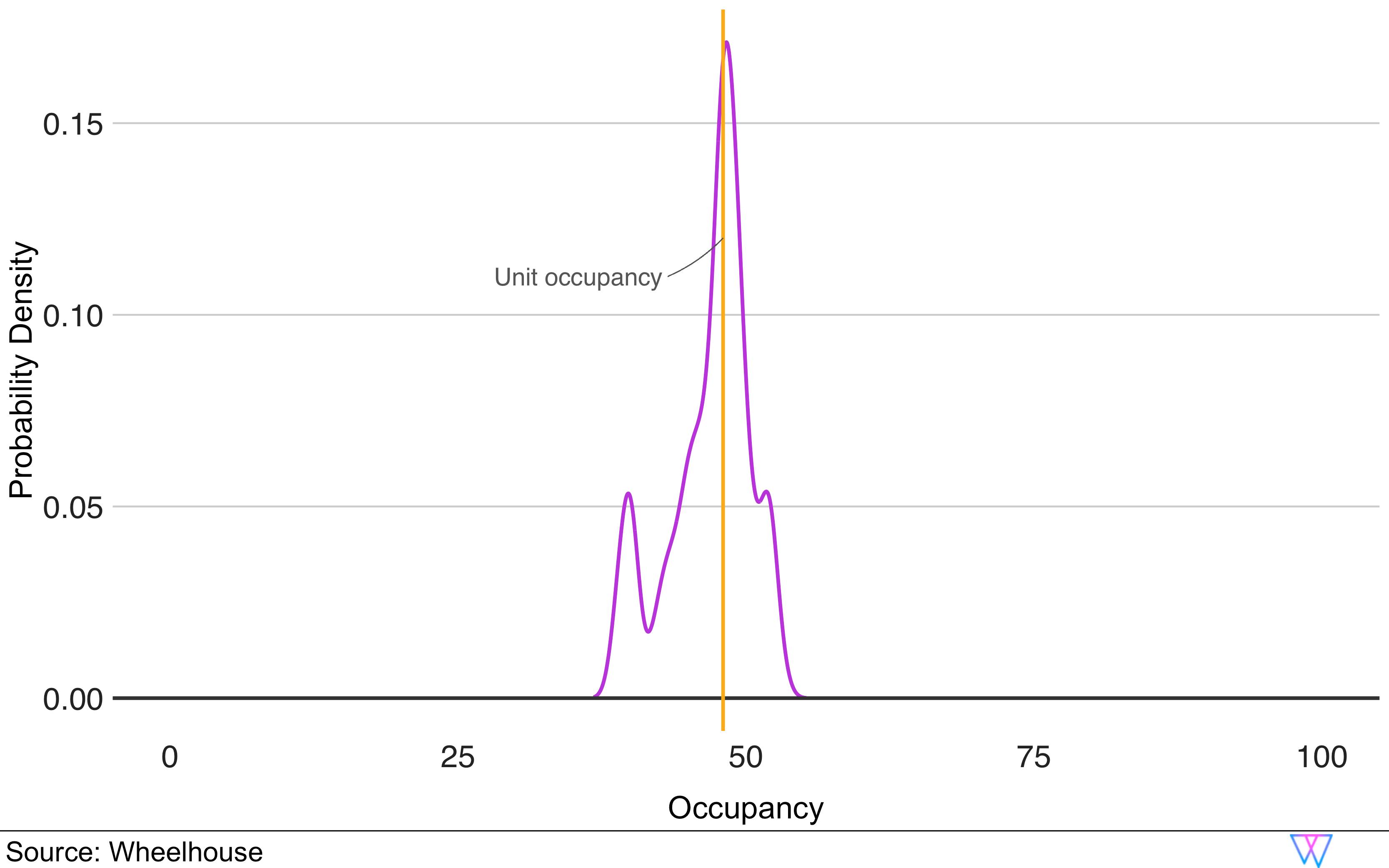
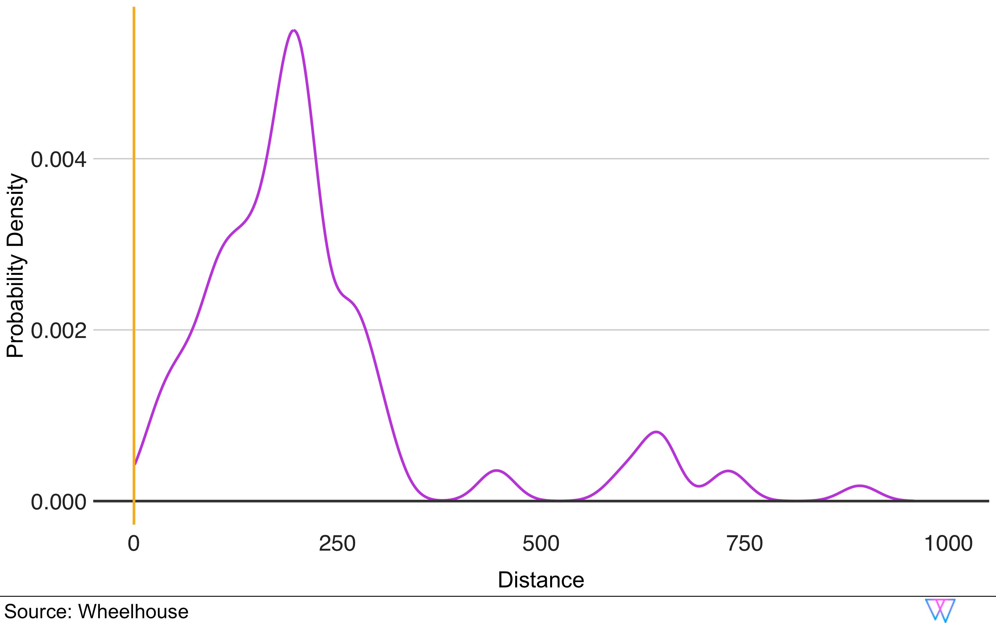
And, while some units show a larger deviation in one of these metrics (e.g. base price), these units, in turn, are more similar in the other metric (e.g. occupancy). The third chart below offers one more vantage point to see how our Comp Set model works.
In short, when we examine the distance metric, you can see that while our comparable set model clearly favors units that are close by, it also considers some units farther away, if they show very similar performance metrics.
In total, Wheelhouse’s Comp Set model analyzes and identifies both a broad and narrow set of comparable units. Over the years, our data has illustrated that it is best to price against a larger set of ‘potential comparable units’, as opposed to a smaller set of ‘certain comparable units’.
Additionally, due to this approach, we can show customers a broader set of ‘potential comparable units’, which can be useful in providing a broader range of insights when either (a) comparing performance metrics or (b) deciding on a pricing strategy.
Share this article
In this article