Chapter 2: Identify
This chapter of Active Revenue Management shows you how to leverage data, tools, and processes to identify opportunities for your portfolio to earn more revenue


Updated January 14, 2025

Table of contents
- Intro
- 2.1 Analyzing Bookings
- 2.2 Identifying "At Risk" & "Expiring" Inventory
- 2.3 Identify, via Pick-Up Analysis
- 2.4 Pickup Shapes: "Peaks & Valleys"
- 2.5 Cliffs, Declines, Inclines, Bookends & Combos
- 2.6 Identify, via Same Time Last Year (STLY) Data
- 2.7 Identify, via Pacing Charts
- 2.8 Identify, via Benchmarking
- 2.9 Identify, via Calendar & Availability Review
- 2.10 Identify, via Retrospectives
- Conclusion
- Next up
Intro
With the foundation you developed in Chapter 1 now in place, you are prepared for the next step of Active Revenue Management - Identifying Opportunities to increase revenue from your portfolio.
Experienced Revenue Managers know there are many signals they can look for to find places to earn more.
These signals include:
- Identifying time periods where bookings are ahead of expectations - either for your portfolio, CompSet, or market - in order to increase your pricing.
- Recognizing when 14 days without a booking is a concern vs. a normal occurrence at this time of year.
- Identifying if a time period (e.g., Spring Break) is much slower year-over-year, and understanding if strategies from prior years are now poised to underdeliver on your revenue & occupancy goals.
- Isolating properties that have not received a lot of bookings recently, indicating you might need to adjust Minimum Length of Stay restrictions (MLOS) in order to drive occupancy.
- Determining if your listing needs a substantial overhaul, either in strategy or listing design.
In this chapter, you'll learn multiple tools, skills and processes you can leverage to identify opportunities effectively, keeping your owners, teammates and pocketbook happy.
2.1 Analyzing Bookings
Frequency: Daily
Suggested schedule: At least Monday - Friday
Bookings are the most unassailable evidence as to whether your pricing strategy is working as expected.
Therefore, the first skill to develop in order to better identify opportunities is how to review and analyze a booking (or reservation) table.
Becoming proficient at this activity will help you quickly get a pulse on daily, local demand signals, and increase your awareness of which rates are "actualizing" (i.e., getting bookings, thereby illustrating what guests are willing to pay for various stay dates/inventory types).
Booking tables are a feature of essentially all Revenue Management and Property Management Software (RMS/PMS).
These tables are usually sorted by "Reservation Date" (or "Booked Date"), enabling you to see your most recent bookings at the top of the table, as is shown in the example below.


The benefit of using a table format (as opposed to just a reservation list) is that it enables you to view valuable data associated with each booking, including:
- Listing booked (name, or other property attributes)
- Stay Dates
- Length of Stay
- Lead Times
- Total Revenue
- Fees
And, while a simple list of reservations will suffice in a pinch. A table view - with at least all of these associated columns - will prove to be far more helpful in time.
Leveraging your Booking Table
As you review your bookings, your goal is to identify unusual or unexpected booking patterns that might signal an area for you to investigate further.
For example, you will want to flag and investigate bookings that have lower than expected ADRs, far-future stay dates, long lengths of stay, or bookings for known holiday that have short length of stays.
These bookings well illustrate an opportunity or problem, and therefor an immediate action to take:
- Lower than expected ADRs? Quickly review you pricing calendar, to make sure prices are set correctly, and perhaps check your current rates against the market, a CompSet, or last year's prices.
- Far future bookings? Perhaps a new event or booking pattern is emerging that could drive more revenue. Consider reviewing local event calendars, or messaging the guest to see if they might share why they booked these dates.
- Short bookings over a holiday? A short booking over an extended holiday or event might illustrate that you need to update your Min Stay or Check-in/Check-out rules. Catching this quickly can ensure you eliminate as many sub-optimal bookings as possible.
As illustrated here, reviewing your bookings will help you keep a pulse on the general conditions of your market, while also illustrating places where your pricing or stay restriction strategy may not be setup as expected.
Therefore, getting in the practice of analyzing your booking table daily is an excellent first step in identifying opportunities or risks to your revenue strategy.
We can make this daily practice even more powerful (and scalable!) by combining this with pickup & pacing analysis, the next skill that will help us build toward a more wholistic understanding of your portfolio performance.
2.2 Identifying "At Risk" & "Expiring" Inventory
Frequency: ~2 times a week
Suggested schedule: Monday and Wednesday
Expiring inventory refers to room nights that are at risk of going unsold.
As is commonly stated in our industry, "You can never sell last night's vacancy." And, the closer a vacant night gets to its arrival date, the fewer opportunities remain to capture a booking. This makes it crucial to closely monitor upcoming dates with unsold inventory, especially dates that are approaching the end of their typical booking window.
In the short-term rental industry, the expiring inventory window typically ranges from 1-12 weeks. However, experienced revenue managers treat this window as fluid, adjusting their definition of "at risk" based on current performance and recent booking pace.
For example, the timeframe for determining what inventory is considered "at risk" or "expiring" include
- Property type and size
- Market location
- Seasonality
- Local events
As a best practice, maintain vigilant oversight of your booking pace and implement strategies that generate a steady flow of bookings throughout your booking window, rather than waiting until dates become very at risk before taking action.
For example, in the chart below, we can see booked nights for upcoming stay dates in an example portfolio (the dark pink areas are recent bookings). While some upcoming nights are selling well, you would certainly want to be analyzing your pick up for these stay dates daily, in the hopes of fine-tuning your strategy to pacing towards selling out all 100 nights (more on this in the next section!)


As discussed above, there are several factors you need to consider in order to drive an optimal strategy for your At Risk inventory:
- Inventory Size - Properties with more bedrooms/sleeps generally become "at risk" much sooner
- Market Type - Markets near major airports (urban markets in particular) often have shorter booking windows, and therefore you can be more comfortable having vacancies closer to the stay date
- Market Booking Patterns - Regardless of market type, it's important that you have a clear understanding of how many bookings in your market are made "last minute"
- Current Portfolio Performance - If you have a strong base of occupancy, you'll think of your "At Risk" inventory differently. Being able to examine both individual listing availabilities and compare them to your portfolio's overall occupancy level can be a valuable determinant of your "At Risk" strategy
- Owner Type - Certain owners are very sensitive about vacant nights, especially for holidays. For these properties, your "At Risk" time period might start much sooner as you aim to ensure their property books and that owner remains happily part of your portfolio
There are always a range of variables to consider when making any strategic decision.
Do you know your CompSet is sold out? Did you just get two big bookings this morning for those "At Risk" nights? Is a weather pattern looking promising or terrifying?
All these real-time factors and changes in your market can cause an experienced revenue leader to adjust what they consider their optimal strategy.
In a sense, this is what makes Revenue Management strategy so darn fun!
Adding Market Data to "At Risk" Insights
Most importantly, you will want to look at a distribution curve of your market.
For example, in the chart below, we look at the Lead Time Distribution for the San Juan Islands in Washington state.
In this case, we can see that ~50% of all bookings occur in the last 25 days before the stay date.
If you were to further break this down by bedroom size and property type, you could more in very precisely on your market's recent booking patterns, and hone in your definition of - an approach to - "At Risk" inventory.


At Risk Inventory Review
As a weekly practice, you should review your rates and daily occupancy levels for upcoming stay dates.
- If demand is low, consider lowering rates or offering promotions on OTAs/your direct site.
- If demand is high, ensure your rates are optimized to capture maximum value.
- Consider lowering any Minimum Stay restrictions, to drive "fill in" bookings.
- If hitting your Minimum Rates, consider reaching out to owners to see if they want to adjust those minimums to try to capture more bookings.
And remember, setting up automated Time-based rules via your RMS can help alleviate the need for consistent manual intervention.
2.3 Identify, via Pick-Up Analysis
Frequency: ~2 times a week
Suggested schedule: Monday and Wednesday
Using a Pickup Chart to Visualize Booking Patterns
A pick-up chart is a highly effective visual, that shows how Booked Nights are accumulating for upcoming stay dates.
This visual can help you quickly identify time periods with high or low occupancy, while also showing your performance for other key metrics such as Revenue, Occupancy, Booked Nights, Average Daily Rates (ADR), or Revenue per Available Room (revPAR).


All of these metrics may be helpful in identifying "compression" or "off peak" periods that have especially high or low demand.
And, while a basic pickup chart can be sufficient, more advanced revenue analysis requires features that allow you to examine your performance from many dimensions.
Lets discuss some of those dimensions:
Granular Control
Ideally, pick-up charts should allow you to easily view performance aggregated on a daily, weekly, or monthly basis, enabling you to easily zoom in & out on areas that need extra attention.
Below you'll see a (very) zoomed in version of this type of Pick-Up chart by day of week (or at the "Daily" level). This view is simple in theory and highly effective in Active Revenue Management.


This chart displays the Booked Nights on a given day (Thursday, Friday, and Saturday in this example). Booked Nights is a metric that is essentially equivalent to the number of listings or properties reserved on that day (e.g., Saturday has the most properties booked currently at 3 total bookings).
Filtering
And, this chart should have filters that enable you to cut to any view of your portfolio you might find valuable (bedroom count, neighborhood, listing quality, listing performance, an amenity, etc)

The above image shows again the Daily Booked Nights chart but this time only for the 2 bedroom properties (a segment!) within the portfolio.
Pacing Visualization
Additionally, an ideal pick-up chart will include visual indicators that help you understand the pace of pickup.
For example, you'd ideally be able to see any metric (e.g. "Nights Booked") as well as recent activity (e.g. "Nights Booked, Last 7 Days") in one chart. In the chart below, you'll notice that the daily booking values now include darker purple blocks, which is illustrating recent bookings (last 7 days), in addition to the day's total booking volume.


The above image is the same as the first we looked at with the addition of "pacing" for the last 7 days. You can interpret this pacing in regular language as "Half of the Nights Booked for the upcoming weekend (Thursday included) have happened in the last 7 days".
Metric Overlays
And, even more advanced pick-up charts will enable you to overlay additional metrics, such as lines indicating ADR (Average Daily Rates) or RevPAR.
By adding in this ADR line, you will not only be able to see what dates are "in demand" (the highest vertical lines), but you can also see dates where customers are willing to pay more for your properties.


For example, in the image above we can now see the booked nights and the ADR for each given day. Now, you can clearly that not only are most people staying on Saturday, they're paying more for that day as well.
Bringing it all together
In practice, you'll want to look at more than three days at a time so this means broadening the scope of what dates you're looking at. On your Wheelhouse pickup table, you can view bookings up to the next 2 years.


Above is an example of a zoomed out version of what we looked at with the first few images. Now, instead of just looking at Thursday, Friday, and Saturday, we can see 18 months of days.
With this much data, let's start discussing how to leverage shapes, to begin quickly identifying the right places to zoom in on your performance and potentially adjust your pricing strategy.
2.4 Pickup Shapes: "Peaks & Valleys"
One of the reasons Pick Up charts are so valuable is that they are extremely effective at creating easily identifiable shapes that can accelerate your revenue decisions.
The most important shapes to begin to recognize and leverage are “Peaks and Valleys".
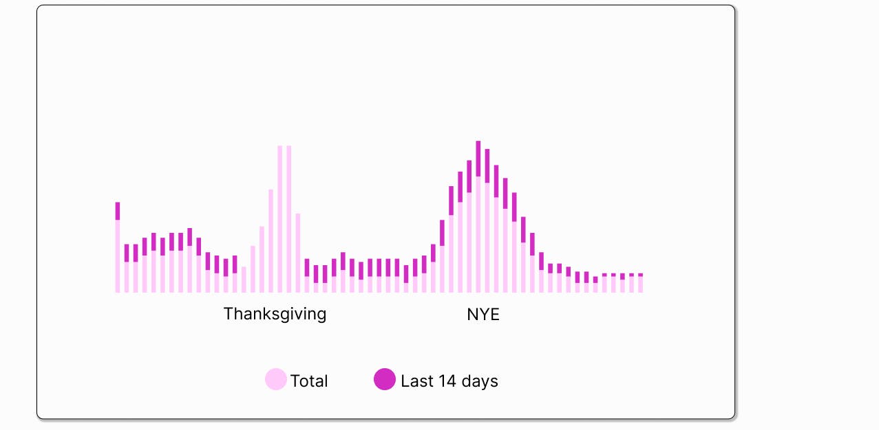
To again reference this chart, we can clearly see elevated occupancy around the end of November and the end of December (Thanksgiving, Christmas, and New Years, respectively).


These "peaks" illustrated time periods where "compression" - our industry's term for when high demand periods - enables you to charge more for your listings.
Additionally, in the example we can see "valleys" that occur between Thanksgiving and Christmas.
These are time periods (often midweek, or in low/shoulder season, or due to weather/economic uncertainty, etc) that you'll want to watch closely, in order to focus on capturing bookings when fewer people are traveling.
2.5 Cliffs, Declines, Inclines, Bookends & Combos
Understanding the common shapes that the above chart can take will help you more quickly synthesize the health of your portfolio. Below are a few of the most common shapes that the daily occupancy/booked nights chart can take. These are conceptual shapes that can have a direct impact on what actions you should take.
Keep in mind that the overall number of listings and actual occupancy numbers can be independent of the below shapes. You can have high “peaks” in occupancy, which indicate high demand days and often sellouts, but the rest of your calendar can have low occupancy which is a concern. It is also good to note that you will often see a combination of these shapes throughout your calendar!
Peaks and Valleys


Where: Can occur anywhere on the calendar
What: Indicates high or low demand
In practice
Look for peaks outside of booking window in order to increase rate positions. Look for valleys especially just inside/outside of booking window in order to lower rate positions.
Cliff or drop off

Where: Can occur anywhere on the calendar
What: Indicates a sudden decrease in occupancy after a specific date.
In practice
Look for cliffs inside the booking window due to the urgency of needing to sell lower occupied dates. Check that these dates are not blocked on the calendar.
If there are no blocks, check that your rate positions (asking rates) are not increased too high, starting at the date of the “cliff”. If there are increases placed then remove them, if not drop rates regardless.
This can sometimes indicate poor rate management. If rates are brought up via premiums on a time-based schedule (i.e., via your RMS) or rates have been decreased heavily for only specific dates then you may see this shape appear in your daily occupancy chart.
Steady decline

Where
Often observed as dates move away from the current date (i.e., this often happens if rates are gradually discounted in the short term) or after high season dates (i.e., dates are moving into shoulder or low season).
What
Look for a soft negative slope or gradual decrease in bookings as dates move away from the current date.
In practice
This may seem at first as a “bad” sign but it can indicate a healthy practice of good rate management. As long as this trend continues (i.e., where the dates closer in trend towards a sell out) then a steady decline is okay. Now, if you are moving towards your high season, you may also like to see a “peak” or “steady incline” within this overall “steady decline”.
Steady incline

Where
Often observed as dates move away from the current date or after low or shoulder season dates that are in the future (i.e., dates are moving into high or shoulder season).
What
Look for a soft positive slope or gradual increase in bookings as dates move away from the current date.
In practice
This can indicate a good “base of business” (i.e., enough occupancy on the books to work with rate position with less risk) and is often occurring as dates move towards shoulder or high season.
Bookending

Where
Often observed during high demand periods or between major event dates.
What
Look for a significant drop in occupancy between two or more highly occupied time periods.
In practice
This can indicate that price or restrictions in place are too strong over a specific date range. It can also naturally occur as demand/compression in the market plays out. This can either be of no concern or something you should keep your eyes on, especially if this is happening in the far future.
For example: if you notice this shape far out during your peak season you should check that your rates are not positioned much higher during the dip in occupancy time period.
Combination


Where: Can be observed on the entire calendar.
What: Look for all of the above shapes combined in various permutations.
In practice
In reality, you will often see all of the above shapes within a well managed portfolio. Understanding each individual part will help you, as the RM, manage the various timeframes on the calendar.
Example of Pacing Analysis
Considering the pacing of bookings is incredibly important during this process. Let’s use the above example on the daily occupancy chart with Thanksgiving and Christmas/NYE.


Notice the bars during Christmas/NYE have highlighted top portions in darker pink. This is indicating the number of booked nights garnered over the last 14 days for each day. Now, notice that the Thanksgiving time period has no highlighted tops, which indicates there have not been any nights booked for Thanksgiving week over the last 14 days. Pacing wise, Christmas week is continuing to book while Thanksgiving week has stalled. This of course could be for a number of reasons:
- Rates are set too high
- There are blocks on the calendar
- Minimum stay restrictions are too high
Regardless of the cause, there is a need for intervention on these dates, especially considering we are now, at the time of writing this, within 60 days of the Thanksgiving dates. We will discuss intervention frameworks and applications in the next chapter.
2.6 Identify, via Same Time Last Year (STLY) Data
An additional (and often critical!) enhancement to your pickup chart is adding in Year-over-Year performance data.
By comparing your booking patterns against the same time periods from previous years, you can immediately identify anomalies (seasonal, day-of-week, events), gain a sense of shifting market conditions, and more quickly and confidently make decisions about adjusting or holding rates and other inventory controls.
A quick review of YOY data can reveal pacing patterns, but a deeper analysis can highlight changes in lead time, price sensitivity, channel performance, segment performance, or other factors that might otherwise remain unnoticed.
Year-over-Year Example
The chart below groups the performance of 54 properties for November 1st - 17th.
The pink indicates this year and the green indicates Same Time Last Year (STLY). The bars are Occupancy and the Dashed lines are ADR.


As you can see, there are a few ranges where an intervention may be necessary. However, the most apparent range is November 15th - 17th.
The occupancy for these days is much higher than at the STLY, and much higher than any other dates in the first half of November.
Additionally, the ADR is higher than STLY, but mostly due to no bookings having occurred in this range last year.
If you detected a similar pattern in your YOY data, you would likely want to increase prices, since both ADR and Occupancy are pacing above STLY.
In the next chapter we'll examine a simple ADR and Occupancy Intervention Matrix that can help accelerate your decision making when you encounter this or other portfolio performance scenarios.
As Revenue Managers, we can't help but note that in this example, you may actually NOT opt to push rates too aggressively since these dates are ~45 days away. Darn! If only we had noticed this pattern a bit earlier!
2.7 Identify, via Pacing Charts
Frequency: ~2 times a week
Suggested schedule: Monday and Wednesday
An additional tool for analyzing your revenue strategy is the Pacing Chart.
Pacing charts visualize how quickly you are accumulating bookings, revenue, occupancy, or other metrics for a particular day or time period (aka, your "pacing").
The chart below shows an example of revenue pacing.
In this chart, each horizontal colored line illustrates how much revenue is "on the books" (the Y axis) relative to the number of days from stay date (X axis, with "0 days to go" on the right).
The horizontal lines that have reached "0" (the far right side of the X axis) show where prior months ended, in terms of revenue.
In this chart, you can see that this month's revenue (shown in the quickly climbing blue line) is poised to end much higher relative to prior months.
Pacing charts make it easier to see when bookings usually take place in your market, revealing and reinforcing your understanding of your market's booking window.
Additionally, they make it easy to see if your portfolio - or any aspect of your portfolio - is booking ahead or behind schedule.


Attribute-Based Segments & Pacing Charts
By leveraging advanced RMS platforms or spreadsheets, you can even compare pacing for different segments.
For example, let's explore a pacing chart that compares booked nights for 2-bedroom vs. 4-bedroom homes in your portfolio.
In the chart below, the solid line reflects the "nights sold for 2BD homes" and the dotted line tracks "nights sold for 4BD homes".
What you can see in this chart is that 4BD homes started selling earlier than 2BD homes - a common pattern as larger groups usually plan and book further in advance.
However, bookings for 2BD homes accelerated in the last few days, jumping ahead of 4BD homes.


In this case, by comparing different inventory types, you are beginning to see booking patterns that you could leverage (larger homes book earlier) to create a pricing strategy that captures this pattern.
You will also start to gain a sense of whether a particular inventory type is booking faster or slower than expected, enabling you to intervene in your strategy faster and more precisely to drive more revenue.
In this example we looked at pacing by bedroom count. However, this is a valuable analysis to extend to other attributes or amenities, such as homes with a pool, patio, pet-friendly policy, etc.
Year-over-Year Pacing Charts
Additionally, you can leverage pacing charts to understand your performance year over year.
In the image below, we are looking at an example of how May paced in 2024 (the dotted line that reaches the right side of the chart) vs. how May is pacing for 2025 (the solid pink line).


What you can clearly see is that you were pacing behind last year's revenue, but have made up a lot of ground in the last 30 days to catch up to last year's pace.
This would be a valuable detail to share with your teammates, owners or other stakeholders!
Often, significant changes in your pacing illustrate when your revenue strategy was adjusted. Therefore, it's valuable to track notes about any major strategic adjustments you made, and leverage a pacing chart to see the impact of those changes.
Segments + Pacing for A/B Testing
You can even leverage pacing charts to run an effective A/B test on any aspect of your strategy or portfolio.
For example, we have selected two groups of properties, based on their Minimum Stay policies:
- In Group A, we are tracking properties with a 1-night Minimum Stay
- In Group B, we are tracking properties with a 2-night Minimum Stay
Despite the groups having different numbers of listings, we've "toggled on" an "Average Per Listing," meaning that we can compare the impact of a setting, regardless of different sample sizes.
In this example, we can clearly see that a 2-night Minimum Stay has a significant impact on Booked Nights (and likely revenue).
This type of data (how restrictions impact revenue) could be very valuable analysis to bring to your team or other stakeholders, in order to drive decisions about optimal Minimum Stay requirements across your portfolio.


2.8 Identify, via Benchmarking
As discussed in Chapter 1, Benchmarking refers to the process of comparing your property's performance metrics against your market, sub-market, or CompSet. You can even (as we saw above) benchmark against your own portfolio, or against your own historical data.
By identifying the right properties to benchmark against, you can more easily uncover opportunities for improvement, understand where you are performing well, identify seasonal or shifting booking patterns, and even communicate realistic forward-looking performance goals (based on evolving market conditions).
Pricing-Specific Benchmarking
One goal of creating a good set of properties to benchmark against is to plan out specific pricing strategies.
For example, in the chart below we are leveraging Wheelhouse's In Context chart to show a listing's current price vs. their competitors' current pricing.
As you can see, the pink line (this listing's price) is above the competitors' average price. However, the green shading indicates this listing is getting bookings, even at these higher prices.
This information can be incredibly valuable in identifying, adjusting or communicating strategic decisions, all tied to effective benchmarking.


Performance-Specific Benchmarks
A second goal of benchmarking is to review aggregated performance benchmarks.
Beyond the specifics of competing for upcoming bookings, it's crucial to understand whether your property consistently performs against competitors over time.
For example, if a listing achieves higher occupancy but lower ADR than competitors, this might indicate an opportunity to increase rates during peak demand periods.
Conversely, if your rates are competitive but occupancy lags behind, you might need to enhance your property listing, improve amenities, or reconsider your minimum stay requirements.


2.9 Identify, via Calendar & Availability Review
Frequency: ~2 times a week
Suggested schedule: Early in the week and later in the week
Using charts and tables is always ideal when looking for areas of intervention, due to the concise and informative view they provide.
However, sometimes it is necessary to scan the calendar for areas of opportunity.
Examining your calendar regularly can highlight dates for pricing or minimum length of stay (MLoS) interventions. For larger portfolios, multiple calendars can be reviewed at the same time via a "Tape Chart" or multi-calendar visualization.


Here are a few key aspects to review when you are analyzing your calendars:
Posted Rates
Check that your bookable rates align with current market conditions and demand. This is typically done in conjunction with the Pick-up analysis described above.
A common practice in the low season is to monitor Min. Rate restrictions, which can often be set high by property owner’s requests, and look to lower these if possible. Your RMS, such as Wheelhouse, may have options for bulk adjustments to these rates.
Gap Nights
Identify any gaps between bookings. Depending on the size of gap and days of week impacted there might be opportunity to be had with a change to minimum length of stay (MLoS), Check-in/Check-out restrictions, or pricing adjustments.
Consider strategies to fill these gaps, such as: Offering discounts for extended stays, Adjusting MLoS restrictions, Promoting reservation extensions to guests on either side of the gap.
Blocked Nights
Review any blocked nights and assess with your team if these blocks are still necessary.
Communicating with your reservations and operations team regarding blocks is a vitally important task as a Revenue Manager. Shortening unnecessary blocks or even removing them completely allows for more nights to be sold, which in turn will yield higher revenue for your company.
Opening more nights for Sale
One goal of Revenue Management is to sell as many nights as possible.
In the hotel space, this often means leveraging overselling of inventory, and of selling a "unit type" in order to move bookings around, and open up room blocks.
In the vacation rental space, there is a different set of strategies you can apply to maximize the number of nights you have for sale, including messaging owners who have upcoming blocked nights, in order to see if those clients might be interested in opening up those nights for sale.
Being able to identify these nights, and communicate how much revenue an owner could expect from selling those nights, can be an enormous value driver from your revenue management practice.
And, that high-touch approach you take with owners could lead to them agreeing to give you more nights for sale in the future.
In the image below, we illustrate how Wheelhouse's Portfolio Calendar view enables you to sort & filter your listings by upcoming "Blocked Nights", in order to accelerate your practice of opening up more nights for sale.


2.10 Identify, via Retrospectives
Frequency: At a minimum, to be done after high season
In our experience, the teams that derive the most revenue from their portfolios year-over-year make time to regularly conduct retrospective analyses (or "post-mortems") of their performance.
Revenue management and pricing decisions are always a best guess about how to handle an uncertain future.
Therefore, taking time after your busy season (or a major event) to analyze how your team prepared, analyzed, and adjusted your strategy to drive revenue is a healthy and productive activity.
Ideally, you emerge from these sessions with well-documented learnings that help you identify future opportunities more precisely and can immediately update aspects of your forward-looking strategy, either at a portfolio, market, segment, or listing level.
Be blunt in your assessment - a healthy post-mortem should highlight strategies that succeeded and honestly detail the places where your strategy did not deliver.
Example Questions for Retrospectives:
- Did we achieve our revenue goals? Why?
- What markets or segments of listings fell short of, or exceeded, expectations? Why?
- What were the drivers of those differences?
- How did we perform compared to our competitors?
- What were our biggest missed opportunities? Why?
- In retrospect, where should we have made a change sooner? Why?
- What data would have helped illustrate any particular opportunity better? Why?
- What do we want to update about our strategy moving forward?
Conclusion
In this chapter you learned a powerful set of skills to drive your revenue strategy forward, including:
- Leveraging Booking Tables - to quickly identify daily booking patterns and opportunities
- Pickup Charts - to visualize specific daily opportunities across your portfolio
- Pacing Charts - to aggregate performance and easily compare different strategies
- Year-over-Year Analysis - to quickly detect anomalies or opportunities against historical performance
- Benchmarking - to add essential market context to your performance metrics
By implementing these approaches, tools, and processes, you're now well-positioned to identify and capitalize on opportunities to increase revenue across your portfolio. (And, you also have more skills to address potential risks in your portfolio performance before they impact your bottom line!)
As you advance in your revenue management practice, you'll naturally begin to blend these various analytical techniques.
For example, you might compare your pickup charts against competitor data to understand which pricing strategy has momentum in your market. Similarly, you might incorporate this comparative analysis into your retrospectives, focusing on who performed better at different stages of the booking window.
Now, let's move to the next key activity of Active Revenue Management: Intervening in your pricing and portfolio strategy after you've identified an opportunity.
Next up
Chapter 3
Intervene
How to make adjustments on identified opportunities using the Wheelhouse method.
Share this article
In this article
Related Research